Tracing fashion transformations: a comprehensive visual analysis of fashion magazine covers
-

 and
and

Abstract
This study looks at the differences and changes observed in the visual design of the covers of French editions of women’s fashion magazines over a period of twenty-one years. To this end, the study aims to identify the changes that can be observed over the years in the design of the covers of the magazines Vogue, Elle, Marie Claire, and Cosmopolitan. However, the main aim of the study is to analyze how these visual signs on the covers of French magazines are designed “differently” and how these signs create a “difference” in comparison to each other. By analyzing these visual elements, the aim of the study is to show the development of design trends and their impact on the visual communication strategies and brand identities of magazines.
1 The effect of visual communication and visual design on magazine covers
Design, which is defined as purposeful organization, is used in almost every field today. Design is evolving in today’s economy as a concept that is associated with and born of art (Hashimoto and Clayton 2009: 15). In order to survive in a contemporary competitive environment, companies need to constantly innovate and change their designs, products, services, production methods, and communication methods, i.e., processes (Bayazıt 2008: 217).
Our age’s acceleration in communication technologies in the development process increases the importance of design in daily life. The burden on design and designers is also increasing, especially in the face of a fast-living and fast-consuming society. Therefore, visual designers must be systematic in the products they design and be socially and visually intelligent people who can follow the trends of their time (Güzeloğlu 2012: 18). One of the most effective factors in communication is the media. All visual and written means of communication tools such as radio, television, newspapers, magazines, and the internet play an active role in human communication and these tools promote interaction, especially in the consumer sector (Harmankaya 2013: 153).
People are bombarded daily with visual advertisements that encourage them to buy certain products or services. However, these images also act as socializing factors that influence and socialize our attitudes, values, beliefs, and behaviors (Kang 1997: 980). Visual design is also gaining importance in fields whose agendas are rapidly changing and encompass various disciplines, such as the advertising sector, which is one of the communication technologies of our time. Advertising messages easily penetrate into our homes, rooms, and workplaces; in short, everywhere we spend time in our daily lives through advertising images in the mass media. These images are associated with the visual design of advertising and become the sources that are frequently seen in various advertising media such as print, television, and multimedia (Küçükerdoğan 2005: 7). Television, newspapers, and magazines are among the most commonly used media when it comes to reaching mass audiences. Compared to other tools, magazines are said to bring about lasting changes in beliefs because they provide a high level of adoption and internalization (Sohn 2009: 40).
According to Jooma (2009: 13), it is widely accepted that, like the advertising process, a cover image in a magazine should attract the attention of a potential buyer. This is due to the special preparation of magazines for people of particular interests. However, it is not only the content of the magazines and the advertisements in the magazines that are very important, but also the images and news headlines on the covers of the magazines. This is because the first point where a reader encounters the magazine is the cover of the magazine (Eşiyok 2018: 40). According to White (1982: 1), the cover is perhaps the most important part of the magazine and a showcase for the product. What people feel when they see the magazine for the first time is the remarkable thing: “it is undeniably there, you cannot stop reacting to it when it looks at you in any way.”
One of the most important elements of a magazine that is a design product is its cover. The cover is like a magazine’s clothing both in terms of its packaging and its effect on the first encounter with the target audience. Therefore, the cover design of a magazine is treated and resolved as a graphic design problem like other visual elements. The magazine cover is a communication area that carries the content of the magazine to the reader. It also carries tips about the content, and often reflects the content completely (Karaduman 2007: 67).
2 Groupe μ and the analysis of visual indicators
2.1 Visual indicator analyses: Groupe μ and design analysis
Groupe μ (or Group μ) is a Belgian research group known for its semiotic and semiotic studies. It was founded in 1967 and focuses on the analysis of visual and literary texts. Semiotics is a scientific field that studies the meaning of signs and symbols and their role in communication. The name of the community, which specializes in rhetoric, is also inspired by rhetoric. The letter μ of the Greek alphabet is the first letter in the word “Metaphor,” the best known of the rhetorical writings (İnceoğlu and Çomak 2009: 281–282).
The work of this group is particularly important in the field of visual semiotics. Groupe μ’s methods for analyzing visual semiotics are used to understand how different signs (signs, symbols, colors, shape, composition, etc.) used in visual media and designs create meaning and how these meanings can be interpreted.
Groupe μ is a research group that works on theories of rhetoric, poetry, semiotics, linguistics, and visual communication. It is said that the first source of semiotics is the work of Barthes and Marin (İnceoğlu and Çomak 2009: 282–283). Groupe μ (1992), which studies objects of a visual nature within the framework of a general lexical theory, distinguishes between linguistic semiotics and visual semiotics with clear boundaries while criticizing visual analysis that remains dominated by linguistic research. In traditional semiotics, it is distinguished from communication and understanding systems by the canal it uses and by the human perceptual apparatus. According to the Groupe μ, a general theory of semiotics for understanding visual indicators requires the consideration of properties that can significantly influence our perception of colors and shapes; in other words, certain properties of the visual canal.
Canals can be uniquely defined by the type of sensory signals they can transmit, whether these signals are auditory, textual (i.e., consisting of recognizable signs), visual (i.e., based on optical quanta), etc. Here the distinction between short and long range seems to depend entirely on the range of the sensory “media.” Communication theory emphasizes the fact that the act of communication relies equally on two moments of realization, the first being the establishment of the communication link and the second being the act of communication itself (Sebeok and Posner 2010: 160).
Verbal linguistics is concerned with the transmission and reception of text or oral communication. This canal refers to messages that are transmitted through the use of linguistic elements, i.e., words, sentences or texts. This canal includes forms of communication in which texts are transmitted in written or oral form and the meaning of these messages is based on linguistic structures. For example, the written text of a book, the oral expression of a speech or the front page of a magazine are transmitted via the oral language canal.
This canal has a fairly clear and unambiguous structure in the transmission of written or spoken messages, and since these messages do not differ significantly in their semantics, the canal itself is usually less important than the essence of the transmitted message. This means that the linguistic canal is not unique and is characterized by the language elements it contains. However, the situation is different for sign systems that use a visual canal. In such strings, causeless connections are rarer, and the visual canal used adds specific features, including physiological properties that are particularly associated with perceptual processes. Researchers studying visual perception have identified the basic elements in the perception of visual strings; these elements include factors such as border or line, outline, surface, shape, texture, and color (Öztokat 1999).
As far as visual objects are concerned, Groupe μ states that there is no important difference between a signe (‘sign’) and a signifié (‘signified’). The signified is a concept that helps us understand how symbols work and how they generate meaning in a semiotic analysis. Furthermore, the signified explains how symbols come together in the semiotic system and carries the semiotic function that enables operations such as prioritizing and remembering something. Therefore, the operations of a perceiving subject, be it an object or a sign, are concentrated in the scriptural phrase. The form, on the other hand, has a social and cultural character. Klinkenberg (1996), a member of the Groupe μ, emphasizes that the quality of the signified is not sufficient to define a level. From forms of writing about the white cane, the cane, clothing and nautical indicators, many script phrases are used deliberately. Visual signs can be divided into four main groups: signs (seeing smoke as an indication of fire), symbols (colors), images (signs produced according to the principle of similarity and causality), and signs in the narrower sense.
The visual indicator is divided into two parts: the visual sign (which refers to an object of external reality by mimesis or analogy) and the plastic sign (which uses the patterns of line, color, and textuality, independent of any reference at the mimesis level). The plane of mimesis is a concept used in art and visual communication that refers to how realistically a visual element imitates objects, events or situations in the real world. The mimesis plane of visual elements is measured by their similarity to reality. This means that the more realistically or accurately a visual element is imitated, the higher the level of mimesis (Gürgün 2021). This concept is frequently addressed in fields such as visual arts, photography, and film, and plays an important role in determining the proximity of a work or image to reality and the way in which the viewer perceives that work.
Both types of signs can appear in a single whole (painting, sculpture, film, graffiti, stamp, cartoon, carpet, rug, etc.), but there are two separate codes at the example level, a painting, a photograph or at most a simple picture can be described as an example of a very regular discourse. They differ, however, in the configuration of their signifiers: “Those that are visually represented consist of discrete units because they are bound to a system of images. This cannot be said of those to whom plastic is shown, the substance is another.” Klinkenberg states that plastic indicators are close to symbol or indicator classes. In most colors there is a considerable number of symbols. Undoubtedly, the symbolic and emblematic qualities of these signs depend on a particular cultural perspective (Öztokat 1999).
According to the Groupe μ, the explanation of the relationship between the signifier, signified and sign should use plastic signs that show the esthetic level of the design and iconic sings including their symbolic meanings. This approach states that the artistic level of design has semantic value in its own name and in itself. There are three values that are considered important in relation to plastic signs; these are shape, colors, and textures. Accordingly, the connection between meaning and indicator is established by form. In his predictions for the analysis of Groupe μ under shape, color, and texture; it is stated that the relationship of meaning will vary according to the conditions of various plastic factors such as light, shadow and direction. (Andersson 2008: 2–11)
3 Identifying the problem and the goal at the center of the research
Today, design has become a concept that we encounter in almost all areas, combining art, communication and technology by building a bridge between different disciplines. This versatility of design is particularly evident in its role in visual communication. In our age of rapidly developing communication technologies, visual design is recognized as one of the most important means of conveying information and esthetic values. Within this broad framework, fashion magazines are one of the platforms where visual design has the strongest impact. Magazine covers are the first points of contact that define a magazine’s identity and influence potential readers. The aim of this study is to analyze the changes in the visual design of the covers of French women’s fashion magazines over a period of twenty-one years and to examine the impact of these changes on the magazines’ brand identity and visual communication strategies.
The study focuses on a detailed analysis of the esthetic and stylistic development of the covers of leading French editions fashion magazines Vogue, Elle, Marie Claire and Cosmopolitan, published between 2000 and 2020. This analysis aims to show how visual communication reflects trends and social changes in the fashion industry. In this context, a detailed assessment of the influence of the visual design of fashion magazines and the role that these platforms play in communication strategies in the fashion world is presented.
In the modern understanding of design, every visual element serves a specific purpose in communication. The aim of this study is to examine in detail how these elements of visual communication are used on the covers of fashion magazines. Based on Groupe μ’s theory of plastic signs, we analyzed the role of basic visual elements such as line, color, texture, and form used on magazine covers, as well as the role of particular elements of visual expression such as illustration, photography, typography, and symbols. This selection is intended to show that the covers of fashion magazines are not just simple surfaces on which clothing and accessories are presented, but also rich communication platforms that make use of a complex visual language and narrative.
The plastic signs on which the research focuses form the basic building blocks of the visual expression of magazine covers. These signs shape the esthetic values of the magazine covers, the brand identity and the communication with the target audience. The plastic signs discussed in our research are the following:
Visual narrative elements: these are the basic components used on magazine covers to convey various messages to readers.
Line: one of the most basic visual elements in cover designs and are used to create form, movement, and depth.
Color: sets the emotional tone of magazine covers and reflects the brand identity.
Texture: expresses visual and tactile quality and adds depth to cover designs.
Form: enable the perception of objects and figures in cover designs and form the basis of the visual composition.
Analyzing these signs has helped us understand how magazine covers have changed visually over time and how this change may be related to trends in the fashion industry and societal changes. The choice of Groupe μ and plastic signs makes this study a comprehensive investigation aimed at analyzing in depth the changes and differences in the visual design of fashion magazines.
The application of Groupe μ’s methods is important for analyzing the meaning of the visual signs (photography, typography, color, etc.) used in the covers of French editions of women’s fashion magazines Vogue, Elle, Marie Claire, and Cosmopolitan, and how these signs create a visual message on the covers. This analysis helps to better understand the visual communication strategies of these magazines and how they have evolved over time. This approach is crucial in fashion and visual communication studies, especially in the in-depth analysis of the visual rhetoric of magazine cover designs.
4 Analytical framework of the research method
The aim of this research is to determine how the plastic signs used in the design of fashion magazine covers have changed over the years and how this change has shaped the visual narrative of fashion magazines and its impact on brand identity.
In this study, we looked for answers to the following problems:
Visual elements of the narrative:
What visual narrative elements are used on the covers of fashion magazines and how does this use affect the visual narrative?
Unique approaches to the use of these visual narrative elements in different fashion magazines and their reflection on brand identity.
Use and effect of line elements:
The variety of uses of line elements on the covers of fashion magazines and the impact of these lines on visual expression.
Unique approaches to the use of lines in different fashion magazines and the effect of these approaches on visual interaction.
Use and effect of color:
The variety of colors used on the covers of fashion magazines and the impact of these colors on the overall esthetic of the magazines.
The preferences of different magazines in the use of color and how these preferences affect brand identity.
Use and effect of texture elements:
The use of textural features on the covers of fashion magazines and the effect of this use on the reader’s sensory perception.
The role of texture in creating visual expression and brand identity on magazine covers.
Use and effect of form elements:
Types of form elements used in magazine covers and the role of these forms in visual expression.
Unique approaches to the use of forms in different fashion magazines and the impact of these approaches on visual interaction
Use and effect of light and shadow elements:
How light and shadow elements are used on the covers of fashion magazines and how this use affects the overall atmosphere of the covers.
How different uses of light and shadow affect the reader’s interest and perception of the magazine.
The method of this research is quantitative. A relational scanning model was used in the analysis of the data collected in the quantitative research method. A relational survey model is a quantitative research method used in the social sciences. It involves examining the existing or potential relationships between two or more variables and analyzing the effects of these variables on each other. In such an arrangement, the variables between which a relationship is sought are symbolized separately. However, this symbolization (assignment of values, measurement) must be carried out in such a way that a relational analysis is possible (Karasar 2015: 81).
Our research focuses on analyzing the meanings conveyed by the visual signs on the covers of Vogue, Elle, Marie Claire, and Cosmopolitan magazines and the differences in these signs between the magazines. The relational survey model is considered an ideal method for understanding the relationships between visual design features and how these features change over time and between magazines. This analysis allowed us to determine the relationships between the visual design features of the different magazine covers and to evaluate the impact of these relationships on the brand identity and visual expression strategies of the magazines. The relational survey model includes complex analyses using statistical methods such as the Kolmogorov-Smirnov test, the one-way ANOVA, and the t-test.
Groupe μ visual semiotic analysis was selected as the research method in which Visual Design Analysis can be most effectively applied to magazine cover design. The plastic values that form the categorization of this analysis are classified in the analysis of the visual elements that make up the magazine cover. The important reason why the visual indicators of the elements that make up the cover of the magazine are handled according to the Groupe μ approach is that “the visual message is largely guided by plastic choices” (İnceoğlu and Çomak 2009: 286). The fact that the elements that make up the cover of the magazine describe the colors, shapes, and compositions showed us that this research must be classified according to plastic qualities. Therefore, plastic indicators were used to explain in detail the visual language of the magazine cover.
A table of plastic values was created to examine the visual aspects of magazine covers. To finalize the table values, a pilot study was conducted. Although the research method used in the pilot study is the same as that used in the main study, two magazines (Vogue and Elle) and 48 covers from two years were evaluated to determine the types of plastic indicators. According to the results of the pilot study, it was decided which analyses should be performed and which visual values should be added or removed. In the study, the general universe is fashion magazines published in France. The working universe is the fashion magazines with the most recent edition in France in 2019. In the selection process, a specific method was used to create the sample group from women’s fashion magazines published in France. According to this method, criterion case sampling, a purposive sampling type, was selected from non-random sampling methods in the research.
According to this criterion, the material of the research constitutes all the monthly published issues of Vogue, Elle, Marie Claire and Cosmopolitan women’s fashion magazines with the highest circulation in 2019 between 2000 and 2020. Accordingly, 985 front covers of magazines from a total of 21 years that were published for twelve months within one year were studied. With the combined publication of Vogue magazine in December–January and June–July, the magazine covers of these months were evaluated in the same way so as not to change the values resulting from the lack of data analysis in terms of numbers. Accordingly, Vogue has the same values for December–January and June–July. In this way, the same amount of data was obtained for each magazine. As a result, 985 magazine covers were evaluated.
The fashion magazine covers analyzed in the study were obtained from the official websites of the magazines and various fashion-oriented internet platforms. Each magazine cover was systematically categorized by year and month of publication to ensure an orderly analysis. This approach made the analysis of the covers more methodical and efficient.
During the data organization and pre-processing phase, the plastic indicators were recorded in detail in an Excel spreadsheet. The plastic indicators on each magazine cover examined were systematically evaluated and coded by the author and a colleague. This one-to-one observational approach ensured a high degree of accuracy and consistency in data collection and coding.
Each magazine cover was examined in detail and the plastic indicators were coded with “1” (present) or “0” (not present) according to their presence on the magazine covers. For example, if the use of warm colors was detected on a magazine cover, this was marked with “1” in the database. Using this coding system, we were able to determine which color groups were most frequently preferred for the various magazine brands. This data set was then transferred to the SPSS statistical package for further analysis. This transfer made it possible to carry out the necessary statistical analyses to answer our research questions.
The Kolmogorov-Smirnov test was first used to check whether the data collected corresponded to the normal distribution. This important step allowed us to assess the conformity of our data set to a normal distribution, which helped us in the selection of subsequent analyses. After determining that the data fit the normal distribution, a one-way ANOVA was conducted to determine if the visual characteristics of the magazine covers (e.g., line, color usage) showed significant differences between the different types of magazines. This analysis helped me to understand how the visual characteristics differ between the different types of magazines.
The t-test for independent samples was used to test whether there are significant differences in the use of certain visual features between two different magazine brands. This analysis is crucial to understanding how certain visual characteristics differ between the various types of magazines. The use of the one-sided ANOVA and independent samples t-test played a crucial role in our understanding of the distribution of visual features between magazine types and formed a fundamental building block for testing the hypotheses of our study.
In the descriptive part of the study, the frequency and percentage distribution of visual features on the covers of magazines were calculated. This allowed me to identify the most commonly used visual features on magazine covers and the overall usage rate of these features. Descriptive statistics provided valuable insight into the evolution of magazine design trends over time by calculating the frequency and percentage distribution of visual features used on magazine covers (Figures 1 and 2).

Evaluation scale of plastic sign types.

Evaluation scale of plastic sign types.
4.1 Evaluation scale of plastic sign types
Total number of women’s fashion magazines.
| Fashion magazines | 2000–2020 | Missing numbers | Total |
|---|---|---|---|
| Vogue | December–January and June–July are published in combined and other monthly numbers (210 covers). | – | 252 |
| Elle | Each month-specific issue is published separately. | – | 252 |
| Marie Claire | Each month-specific issue is published separately. Published only from June to July 2020 combined. | 2001: January 2002: August 2003: May  5 units 5 units2006: July 2007: April |
247 |
| Cosmopolitan | Each month-specific issue is published separately. Only 2019–2020 December–January combined is published. | 2000: January–March–August–December 2001: August–October 2002: February 2003: May–October 2005: May–June–July–December  18 182006: August–September 2007: August 2008: February 2010: August |
234 |
| Grand total: | 985 magazine front covers examined. |
Values in connection with plastic signs in magazine cover designs.
| Design elements | Types | ||
|---|---|---|---|
| Plastic signs | Visual narrative elements on the cover of the magazine | Illustration | |
| Photograph | |||
| Typography | |||
| Color | |||
| Icon- symbol | |||
| Line | Straight line | Grainy lines | |
| Broken line | Circular line | ||
| Tick line | Diagonal line | ||
| Pinstripe | Dashed line | ||
| Curved line | |||
| Color | Primary colors | ||
| Accent colors | |||
| Contrast colors | |||
| Bright colors | |||
| Cool colors | |||
| Neutral colors | |||
| Texture | Real texture | ||
| Visual texture | |||
| Spatial texture | |||
| Shape | Geometric shapes | Artificial shapes | |
| Organic shapes | Free forms | ||
| Natural shapes | Limited shapes | ||
| Light/shadow | Bright | ||
| Dark | |||
| Shaded |
5 Results
This study analyzes the use of different visual elements on the covers of French editions of women’s fashion magazines. The results show that the magazines emphasize different visual elements:
Vogue: uses line, texture and light/shadow elements more intensively than other magazines.
Elle: attracts attention by using color, line, and shape elements more intensively than other magazines.
These results reveal the characteristics that make the visual expression of each magazine unique. The way magazines use these elements in different ways plays an important role in understanding their visual language and brand identity.
When analyzing the changes in the use of visual elements on magazine covers over time (Figures 3 and 4):
Increasing use of visual elements over time: after 2010, it was observed that the use of visual narrative elements such as line, color, texture, and shape increased on magazine covers. This shows that, over time, fashion magazines have begun to use visual communication strategies in a more complex and richer way. It suggests that magazines created a more striking and impactful visual language on their covers through the use of visual elements. The increase in the intensity of use of visual elements of fashion magazine front cover designs to the present day allows more active operations to be performed with the development of computer graphics programs. In parallel with the development of technology, it can be concluded that much more effective designs are created at the visual level of magazine cover design.
Different use of light/shadow elements: the more intense use of light and shadow elements compared to other elements before 2010 indicates that there was a different style and emphasis on visual expression of magazine covers during this period. This suggests that fashion magazines during that period may have emphasized a certain esthetic or understanding of fashion in their visual expression.
Reflection of trends in the fashion industry: fashion magazines are important indicators that reflect trends and changes in the fashion industry. After 2010, the increasing use of visual elements such as line, color, texture and shape on magazine covers shows that the fashion industry has taken a more visual and esthetic direction. This could be a reference to the fashion industry’s efforts to reflect the esthetic understanding and consumer expectations of the time.
Development in visual communication: after 2010, the increased use of visual elements indicates a development in visual communication strategies. This shows that magazines have started to use more complex and sophisticated visual techniques to influence their readers and attract their attention. This change may reflect technological developments in visual communication and changes in visual culture.
Brand identity and target audience: the way magazines use visual elements shows their brand identity and how they want to address their target audience. The use of more dynamic and lively visual elements, for example, can appeal to a young and dynamic audience. This plays an important role in the brand strategies and marketing approaches of magazines.

Comparative analysis of light and shadow values on the covers of fashion magazines. Figure 3: The cover of Vogue, 2001 April issue. Source: https://models.com/work/vogue-paris-vogue-paris-april-2001-cover.

The cover of Vogue, 2018 October issue. Source: https://models.com/work/vogue-paris-vogue-paris-october-2018.
Before and after 2010, the use of light and shadow on the covers of fashion magazines was analyzed on the basis of three different values: light, shadow, and dark. On the cover in Figure 3, the model is wearing a red, asymmetrical sweater with a black pattern, decorated with a zipper with feather details. While the angle at which the light falls on the model clearly illuminates the model’s hair, face, and arm, the light is cut off when the hair is styled forward over the head, creating a shadowy section that extends to part of the face. In this way, the focus on the point can be emphasized by using light and shadow on the model. On this cover you can see that light and shadow values are used together. In the period before 2010, the use of shadows, which create depth and dramatic effects in visual expression, is more pronounced. The use of more shadows and contrasts between the visual elements is a striking feature of the covers of this period.
On the other hand, the cover in Figure 4 shows a model dressed in bright colors, and there is no shadow value on this cover; in general, the dominant bright value is emphasized on the cover. These observations show how the use of light and shadow on the covers of Vogue magazine has changed over time in terms of aesthetics and emphasis. After 2010, the covers of Vogue Paris began to use brighter and more vibrant colors in terms of overall hue. Bright and eye-catching colors determine the general mood of the covers. The use of shadows has decreased and a more vivid visuality has come to the fore through the use of light. During this period, a modern and innovative esthetic understanding began to shape the design of covers. The poses of the models and the overall composition of the cover have taken on a more dynamic and lively expression. Current trends and innovations in the fashion world become more apparent in the design of covers.
Social and cultural implications of changes in visual expression: these changes in visual expression can reflect general esthetic perceptions, cultural trends and even social norms in society. The changes in the design of magazine covers provide important clues to the socio-cultural and esthetic values of the time. In this context, the changes in the use of visual elements in the covers of fashion magazines show not only developments in the fashion industry, but also changes in the general visual culture, communication strategies, and esthetic values of society.
5.1 Visual elements of the narrative
In our study, the visual narrative elements used in the covers of leading fashion magazines Vogue, Elle, Marie Claire, and Cosmopolitan published between 2000 and 2020 were analyzed in detail. Our results show that elements such as photography, typography, and color were widely used in all fashion magazines during this period. The use of photography in fashion magazines in particular can be seen as an important turning point in the development of visual expression in this area. The leading role of Vogue magazine in this area is a remarkable example of the development of visual expression in the fashion world. In this period, the use of typography and abstract elements (such as fashion, beauty, slogans, names of living models, and general titles of content) on the covers of magazines shows the diversity and richness of the visual communication strategies of magazines. In particular, the pioneering use of symbols by Vogue magazine can be seen as an indicator of innovative approaches in visual communication.
Widespread use and influence of photography: the use of photographs in all fashion magazines shows how powerful and effective visual expression is. The photographs ensure realism, glamor, and professionalism on the covers of the magazines as well as an impressive presentation of models and fashion products.
The importance of typography: typography emphasizes the aesthetics and legibility of the texts on the covers of magazines and at the same time shows how they can attract the reader’s attention. The typography also reflects the personality and style of the magazine brand, which has a certain impact on readers.
The visual impact of using color: how colors are used on magazine covers and how these colors affect the overall tone, emotion, and brand identity of the magazine. Colors increase the visual appeal of magazine titles and help to captivate readers.
Meaning and impact of the use of icons and symbols: one can analyze how the icons and symbols used on the covers of magazines reinforce the brand identity and message of the magazine and how they convey meanings to the reader. Icons and symbols give the cover design more depth and ensure more intensive communication between the magazine and the reader.
Lack of illustration: the fact that no illustrations are used in any of the magazines shows that photography is a preferred means in the visual narrative strategies of the fashion magazines. The lack of illustrations may reflect the fashion industry’s emphasis on realism and direct representation.
The elements of visual expression were analyzed on the basis of five different values: photography, typography, color, icon/symbol, and illustration. Photographs were used for all covers of the fashion magazines shown as Figures 5–7. While in Elle and Cosmopolitan, the photography focuses only on the model, in Vogue it varies with compositions consisting of a combination of model and background. The typography of magazine covers is characterized by the name of the magazine and the main headings that explain the content. In the context of the use of icons and symbols, elements used as accessories in Vogue and Elle, such as Coco Chanel’s iconic “CC” monogram, were found to reflect the luxury, elegance, and minimalist design approach of the Chanel brand. This logo consists of two intertwined “C” letters and is known worldwide as an easily recognizable symbol in the fashion industry. Elle features a cross symbol, which is also used as an accessory. The symbol of the cross is a symbol that has a deep meaning in a variety of cultural and religious beliefs. Cosmopolitan shows an asymmetrical jacket inspired by the design of the American flag. The stars, stripes, and colors on the jacket were considered elements of a national symbol that symbolized the history and unity of the United States. In this context, the iconic and symbolic elements of the images in the magazines were analyzed in this way.
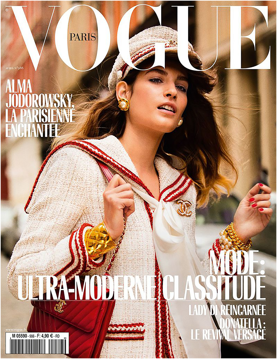
Comparative analysis of the elements of visual narrative. Figure 5: The cover of Vogue, 2018 April issue. Source: https://models.com/work/vogue-paris-vogue-paris-april-2018-cover.

The cover of Elle, 2019 December issue. Source: https://models.com/work/elle-france-kristen-stewart-by-philip-gay-elle-france-dec-2019-cover.

the cover of Elle, 2017 January issue. Source: https://www.famousfix.com/topic/cosmopolitan-magazine-france?year=2002.
5.2 Line element
The use of line elements in the cover images of leading fashion magazines Vogue, Elle, Marie Claire, and Cosmopolitan was analyzed comparatively. The results show that visual expression elements such as photography, typography, and color are widely used in all magazines, but there are significant differences in line elements. It has been noted that all fashion magazines generally use straight and thick lines, but each magazine also uses its own unique line elements. These differences depend on the background decisions of the magazines’ visual designers, the cover model’s clothing style, the patterns, the accessories, and the use of symbols and icons.
Our study evaluated the use of line elements in the cover images in general:
Vogue: circular and dashed lines are used more intensively compared to other magazines.
Elle: diagonal, curved, thin, and grainy lines are the outstanding features of its cover designs.
Marie Claire: grainy lines have become a prominent element on the covers, used in a similar proportion to Elle magazine.
Cosmopolitan: covers emphasize broken lines more than other magazines.
In our analysis of line elements, straight, broken, thick, pinstripe, curved, grainy, circular, diagonal, and dashed lines were analyzed. In this context, we have focused on the clothing of the model and the use of the background on the covers of the magazines. On the cover of the April 2013 issue of Vogue, the female model wears a multicolored and patterned crop blouse with straps and a mini skirt (Figure 8). On the straps and in the chest area of the blouse there are patterns consisting of dashed lines, and on the front center part of the skirt there are patterns consisting of curved and circular lines. When analyzing the background, it becomes clear that the natural landscape consists of curved lines.

Comparative analysis of line elements. Figure 8: The cover of Vogue, 2013 April issue. Source: https://models.com/work/vogue-paris-vogue-paris-april-2013-cover.

The cover of Elle, 2019 July issue. Source: https://models.com/work/elle-france-elle-france-july-2019-cover-1.

the cover of Cosmopolitan, 2018 August issue. Source: https://models.com/work/cosmopolitan-france-cosmopolitan-france-august-2018-cover.
On the cover of Elle, the female model can be seen wearing a bustier in shades of purple, a brick-colored jacket, and mustard yellow lace-up shorts (Figure 9). The strap shape of the bustier draws attention to itself by creating a curved line, while the lines on the shorts are an example of a straightforward design. Grainy lines were discovered on the background of the cover, giving the impression that the background has a structure.
In the issue of Cosmopolitan, the female model wears a blouse with a pattern consisting exclusively of broken lines. Grainy lines formed by sand and sea can be seen in the background. These details show that natural elements and modern lines blend together in the magazine’s cover design (Figure 10).
Some of the points identified in relation to the use of line elements on magazine titles are as follows:
Line diversity and its effect on design: the use of straight, broken, thick, thin, curved, grainy, circular, and diagonal lines on magazine covers shows that these lines enrich the visual expression and create different esthetic effects. Any kind of line affects the visual balance, composition, and reader perception of magazine covers.
The role of lines in visual expression: lines are used on the covers of fashion magazines to add visual interest, direct the visual flow, and support the overall structure of the design. The widespread use of thick and straight lines creates a strong visual impact and clarity on magazine covers.
Brand identity and line usage: the line usage preferences of different magazines reflect each magazine’s unique brand identity and visual language. The fact that Vogue and Elle prefer different types of lines shows that they have their own esthetic understanding and visual strategies that are tailored to their target audience.
The functions of lines in visual designs, especially their functions such as boundary, movement, direction, and balance, are important factors that influence the meaning and perception of magazine designs. The quality and movement of the lines create different effects and meanings, from the overall design to its features. This shows that preferences for the use of linear elements play a crucial role in determining the visual identity and communication strategy of the magazine brand. To summarize, the use of line elements on the covers of fashion magazines is a fundamental aspect of design and plays an important role in shaping the visual narrative of any magazine. These lines have a significant impact on the aesthetics of magazine covers, the interaction with the reader and the brand identity. These differences reflect the unique visual language and design approach of each magazine and reveal the diversity and creativity of fashion magazines in visual expression.
5.3 Color element
We studied in detail the use of color elements in the design of the covers in our sample (Figures 11–15). The research results show that although a wide range of colors is used in all fashion magazines, certain magazines favor certain color groups more than others. Vogue, for example, used neutral colors, Elle used warm colors, Marie Claire used intermediate colors, and Cosmopolitan used rather cold and contrasting colors.

Comparative analysis of color elements. Figure 11: the cover of Vogue, 2020 September issue. Source: https://models.com/work/vogue-paris-vogue-paris-september-2020-cover.

the cover of Elle, 2018 September issue. Source: https://models.com/work/elle-france-lara-stone—sweet-week-end-1.

the cover of Marie Claire, 2015 May issue. Source: https://models.com/work/marie-claire-france-marie-claire-france-may-2015-cover.

the cover of Elle, 2016 January issue. Source: https://models.com/work/elle-france-elle-france-january-15-2016-cover.

the cover of Vogue, 2005 September issue. Source: https://models.com/work/vogue-paris-nicole-kidman.
The color element has an undeniable importance among the design elements, and this is clearly evident in the design of magazine covers. Each magazine is designed with color combinations that match its own image and brand identity. In addition, it was found that the background of the magazine and the clothing of the cover model also play a role in the color selection. This suggests that color preferences are closely related to the personal style of the magazine brand or designer. The use of colors in the cover designs of fashion magazines therefore focuses on the emotional and psychological requirements of the magazine and not on personal ideas or tastes.
Our detailed analysis of color elements covers primary colors, accent colors, contrasting colors, bright colors, cool colors, and neutral colors. Examination of the cover of Vogue magazine revealed that the cover model preferred a yellow blouse, red trousers, and a purple jacket; a blue glove was also used as an accessory (Figure 11). While the title of the magazine is highlighted in blue, the other headlines are in red and white, and the background is black. On this cover, yellow, red, and blue are classified as primary colors, black and white as neutral colors, and purple as an accent color group. In addition, the colors yellow and red belong to the category of bright colors, while blue belongs to the group of cool colors.
The investigation of the Elle 2018 September issue revealed that the cover model was wearing a white sweater and cream-colored boots (Figure 12). The title of the magazine is highlighted in yellow, while the other titles are predominantly in yellow and white. In this cover picture, which is dominated by brown and mustard tones in the background, it is noticeable that predominantly warm colors are preferred.
On the Marie Claire cover (Figure 13), the model is wearing a blue denim shirt and jeans and the background is in shades of blue. The shades of blue used in the title of the magazine and in the subheadings of the cover design show that the cover was generally designed with cold colors.
In the analysis of the January 2016 issue of Elle revealed that the cover model was wearing a shawl in different colors (Figure 14). The shawl is in the contrasting colors red-green and yellow-purple. The title of the magazine is in red and harmonizes with the shades of the shawl, while the subheadings are in white, blue, and red. In the design of this cover, the contrast between the colors of the cloth and the headdress forms a clear contrast, while both warm and cool color palettes are used in a balanced way.
Examination of the Vogue cover revealed that the cover model was wearing a sleeveless mini dress, the collar and the stripes at the hem of the dress were in gray, the name of the magazine and other titles were in black, and the background was in white (Figure 15). It was noted that only neutral colors were used on this cover.
Some of the points noted regarding the use of color on magazine covers are as follows:
Color psychology and emotional impact: the psychological impact of colors plays an important role in magazine covers. For example, warm colors can evoke energy and excitement, while cool colors can convey a sense of calm and professionalism. This suggests that the choice of color in the design of magazines is used as a strategic tool to manipulate readers’ emotional responses.
Brand identity and color harmony: the colors used on the covers reflect the brand identity and character of the magazine. The choice of color can influence a magazine’s appeal to its target audience and brand perception. For example, magazines that want to represent luxury and sophistication often opt for neutral and pastel shades.
Seasonal and trend-dependent use of color: the colors used on magazine covers can also reflect seasonal effects and fashion trends. For example, more vibrant and brighter colors can be used in spring and summer and darker and more saturated colors in autumn and winter.
Visual interest and attracting attention: colors are also used to increase visual interest and attract attention. Bright and eye-catching colors can help attract attention on magazine shelves and appeal to potential readers.
Cultural and social context: cultural and social meanings of colors can also play an important role in magazine covers. A particular color can have different meanings in different cultures, which can be an important consideration for magazines targeting a global audience.
5.4 Texture element
The use of texture elements in the cover designs of our sample was analyzed in detail (Figures 16–18). Our results show that real textures are used extensively in all fashion magazines, with visual and spatial textures being used most intensively in Vogue. We found that real textures on the covers of fashion magazines are evaluated by tangible elements such as the models’ clothes, the accessories they wear, and natural backgrounds. The contribution of textural features to design is important to create dimension and depth and to give products and services a sense of time and space. Textural features on magazine covers are used as an interactive style to shape the experience and emotion of the visual story together with the consumer’s imagination. These characteristics can be interpreted to mean that magazine covers not only appeal to the eye, but also enrich the consumer’s sensory experience. Therefore, in addition to visual expression, the use of textures on magazine covers also has the potential to create a deeper and more interactive communication with the consumer.

Comparative analysis of texture elements. Figure 16: the cover of Vogue, 2005 October issue. Source: https://models.com/work/vogue-paris-vogue-paris-october-2005-cover.

the cover of Marie Claire, 2019 August issue. Source: https://models.com/work/marie-claire-france-marie-claire-france-august-2019-cover/1174877.

the cover of Elle, 2017 February issue. Source: https://models.com/work/elle-france-elle-france-february-2017-cover/973549.
In our comprehensive analysis of texture elements, different texture types such as real texture, visual texture, and spatial texture were considered. Real textures are physical textures that can be perceived with the sense of touch. The clothing and accessories of the analyzed cover models of Vogue and Elle are a representation of such textures. The softness of the fur on the cover of Vogue or the hard texture of the model’s leather jacket and skirt in Elle are examples of real textures that can be perceived with the sense of touch (Figures 16–18).
Visual textures are textures that are only perceived through visual perception without being physically touched. The flower-patterned blouse of the model on the cover of Marie Claire is an example of visual texture (Figure 16). In this case, the floral patterns are not real flowers, but are placed on the garment as a design element and provide visual richness.
Spatial texture is the type of texture that visually represents a space or scene, often conveying a sense of movement or depth. The dynamic image created by the sky in the background of the Vogue cover is an example of a spatial texture (Figure 17). Spatial structure is often represented on magazine covers by natural landscapes or photographs taken at specific locations. In this way, magazine covers can create both a visual effect and an experience for the viewer.
The following are some important points on the use of texture elements on magazine covers:
The role of texture in arousing visual interest and curiosity: textures on magazine covers help to increase visual interest and arouse the curiosity of potential readers. Above all, the wealth of structural elements can make covers more attractive and memorable.
Technological developments and texture design: innovations in printing technologies make it possible to use more varied and sophisticated textural effects on magazine covers. For example, techniques such as embossing, and glossy or matte surfaces can improve the texture of magazine covers.
Texture’s contribution to brand identity: certain texture features can become part of a magazine’s brand identity. A luxury fashion magazine, for example, can reinforce the impression of sophistication and quality by using high-end and authentic textural features on its covers.
Reflection of cultural and contemporary trends: the textures used on magazine covers can reflect cultural and contemporary trends. Textural features that are popular in different eras and cultures can also be found on magazine covers.
Sensory marketing and magazine covers: sensory marketing is an approach that targets consumers’ senses, and the textures used on magazine covers can be part of this strategy. The use of structural elements on magazine covers can enrich the sensory experience of readers and increase their interest and loyalty to the magazine.
5.5 Form element
The use of form elements (Figures 19–22) in the covers of our sample was analyzed. The results of the research show that the use of live models on all fashion magazine covers contributed to the organic form being more widespread than other forms. It was also found that different magazines favored different types of forms. Vogue used limited and geometric shapes, Elle used artificial and free shapes, Marie Claire used natural shapes, and Cosmopolitan used geometric and artificial shapes more than other magazines. Although form is a three-dimensional element, it can be visualized on two-dimensional surfaces such as magazine covers. The lines that define the outlines of the visual elements on the magazine covers create an effect of depth and allow different shapes to emerge.

Comparative analysis of form elements. Figure 19: the cover of Marie Claire, 2016 January issue. Source: https://models.com/Work/marie-claire-france-january-2016-cover.

the cover of Elle, 2018 February issue. Source: https://models.com/work/elle-france-elle-france-february-2018-cover-1.

the cover of Vogue, 2014 April issue. Source: https://models.com/work/vogue-paris-vogue-paris-april-2014-cover.

the cover of Elle, 2014 December issue. Source: https://models.com/work/elle-france-elle-france-december-5–2014-cover.
In our in-depth analysis of form elements, geometric, organic, natural, artificial, free, and limited form types were analyzed. When analyzing geometric shapes, forms such as cubes, squares, and prisms were examined; the cover model of Marie Claire, for example, who wears cylindrical jewelry, is an example of this genre (Figure 18). This type of form was mostly observed in accessories and background designs.
Organic forms were valued by elements that contain life, such as human and animal figures. The use of real models on all the magazine covers examined shows the presence of an organic form. No illustration was found on the covers.
Natural forms were selected from covers with a natural background. This category includes objects found in nature, far from human intervention; an example of this type appears in an issue of Vogue (Figure 21).
Artificial forms include all man-made objects. Clothing, accessories, and various objects used on covers fall into this category. For example, the image of a car in an issue of Vogue is an example of an artificial form (Figure 21).
Free forms are forms that do not resemble any existing object in nature and are created without being subject to any rules. The garment of the cover model examined in the December 2014 issue of Elle is an example of a complex style based on the designer’s own creativity, combining a variety of colors and types of fabric without any sense of harmony (Figure 22).
Limited forms are forms that are shaped according to certain rules, either occurring in nature or designed according to a certain geometric order or function. The cover model’s black and white polka-dotted jacket and trousers, analyzed in the February 2018 issue of Elle (Figure 20), show that the regular spacing and distribution of the dots is an example of a limited shape.
The following are some important points on the use of form elements on magazine covers:
The influence of shape on visual balance and composition: shapes play an important role in determining the visual balance and composition of magazine covers. For example, symmetrical or asymmetrical shapes can affect the overall balance of the cover design and the way it draws the reader’s attention.
Form and visual expression: different forms can express different stories and feelings. Organic shapes can evoke a sense of naturalness and comfort, while geometric shapes can convey a more structured and organized impression.
Use of forms in the context of cultural and fashion trends: the use of forms can also reflect cultural influences and fashion trends. For example, fashion trends that were popular at a certain time can influence the type of shapes on the covers of magazines.
Form and brand image: the form of each magazine reflects the brand image and style of the magazine. By using certain forms, magazines can set themselves apart from their competitors and convey a special message to their target group.
Technological developments and visualization of forms: developments in printing and design technology are making it possible to use more complex and interesting forms on magazine covers. This offers designers the opportunity to create more innovative and creative covers.
5.6 Light and shadow element
The use of light and shadow elements on the covers in our sample was analyzed (Figures 23–25). The results of the study show that the light value is used particularly used in Cosmopolitan, while the shaded and dark values are used intensively in Vogue. Marie Claire used the shadow value more intensively than Elle and Cosmopolitan, while Cosmopolitan almost never used the dark value. The use of light and shadow elements in visual design is important for various purposes, such as adding volume to visuals, highlighting visuals, and attracting attention. If you look at magazine cover designs in general, you will notice that the light value is more favored. It is assumed that the cover of a magazine is the first point of contact with the reader and has the ability to establish rapid communication with the consumer, to motivate, and inspire them. Therefore, the frequent use of bright light values on the covers of fashion magazines is seen as a strategic decision to increase the attractiveness of the magazine.

Comparative analysis of light and shadow elements. Figure 23: the cover of Marie Claire, 2013 June issue. Source: https://models.com/work/marie-claire-france-marie-claire-france-june-2013-cover.

the cover of Elle, 2019 March issue. Source: https://models.com/work/elle-france-elle-france-march-2019.

the cover of Vogue, 2019 June–July issue. Source: https://models.com/work/vogue-paris-vogue-paris-junejuly-2019-cover.
In the analysis of light and shadow elements, light, dark, and shadow values were emphasized. On the cover of Marie Claire, the cover model posed in a very bright environment; this shows that only the brightness value is dominant on the cover (Figure 23). When analyzing Elle, it was found that dark and shadowy values were used together. The lack of direct lighting on the cover meant that some areas remained dark and others shaded (Figure 24).
When looking at the cover of Vogue, it is noticeable that the light reflected onto the cover model from the right angle creates a balanced contrast by displaying both bright and shadowy values together (Figure 25).
The following are some important points on the use of light and shadow elements on magazine covers:
Atmosphere through light and shadow: the light and shadows used on magazine covers have a great influence on the atmosphere to be created on the cover. Bright and vibrant lighting can evoke a sense of joy and energy, while shadowy and dark tones can create a more dramatic and mysterious mood.
Creating emotional impact and meaning: the use of light and shadow can enhance the emotional impact of the images on the cover. Contrasts of light and shadow can be used strategically to emphasize a particular emotion or meaning.
Arouse visual interest and curiosity: light and shadow effects increase visual interest and make magazine covers more attractive. This is particularly important on magazine shelves to attract attention and arouse the interest of potential readers.
Model and product emphasis: on magazine covers, the use of light and shadow on the model’s face or body can emphasize the features to be highlighted. Similar techniques can be used in product advertising to ensure that certain products attract attention.
Technical innovation and creativity: digital processing and advanced printing technologies enable more creative approaches to the use of light and shadow. These techniques increase the visual quality and impact of magazine covers and enable more innovative designs.
Cultural and esthetic values: the use of light and shadow can reflect certain cultural or esthetic values and create a visual language that corresponds to the magazine’s target audience.
6 Conclusions
Considering the results of fashion magazine cover designs, in the design of Vogue, Elle, Marie Claire and Cosmopolitan, it was found that many elements are extensively used in plastic signs. It has been shown that many elements in the visual design of the magazines, sometimes individually and sometimes together, contain many meanings, emotions, and messages. “The formation process of the design and the messages that the resulting image gives to the audience can also be seen as the deciphering of the secret world of the design expression” (Güzeloğlu 2012: 198).
It was observed that the intensity of the use of plastic signs such as lines, colors, and shapes in the design of magazine cover designs varies according to the magazine brand and there is no clear difference. The reason for this is that the women’s magazines whose covers are studied are the same in terms of general design, but the formats used change to varying degrees. The density of the design elements is generally contained in the abstract images and the cover model’s clothing.
Design elements consisting of plastic characters play an important role in the design of magazine covers, not only to embellish and decorate the covers, but also because they give a logical appearance to the vivid combination of abstract images.
Depending on the design of the magazine, it is important how the indicators used by the visual designer when creating a magazine select plastic elements such as colors and lines based on the years and months of the magazine’s publication. For this reason, some design elements are overused in magazines, while others vary from magazine to magazine. This has to do with how the visual/magazine designer is trying to create the look and feel of the magazine brand. As a result, it is possible that there are visual differences in the plastic ads in the magazines.
It was found that all magazine covers were broadly similar in design, but some magazines varied more in color and some magazines varied more in line elements. It was found that all magazine covers were broadly similar in design, but some magazines varied more in color and some magazines varied more in line elements. Accordingly, every element (color, line, texture, shape, and light and shadow elements) used in the details of magazine design is seen a means of distinguishing the magazines from each other and revealing their design.
This study analyzed the use of visual elements in the cover designs of leading French editions of women’s fashion magazines Vogue, Elle, Marie Claire, and Cosmopolitan between 2000 and 2020. The main findings are as follows:
Use of visual elements: each magazine has made extensive use of various visual elements (photography, typography, color, etc.) in the design of its covers. Vogue, for example, uses the element of line and Elle uses color and texture elements more intensively than other magazines.
Meaning, emotions, and the transmission of messages: the visual design of the magazines contained various meanings, emotions and messages, sometimes with a single element and sometimes with several elements together.
Frequently used elements: the research has shown that some elements such as photography, typography, and color in fashion magazine designs are commonly used by all magazines.
The significance of these findings helps us to understand the visual communication strategies of fashion magazines that reflect brand identity and how these strategies have evolved over time. Magazine covers not only reflect fashion trends, but also changes in visual culture and communication. This analysis is an important tool for understanding the visual language of fashion magazines and tracking trends in this sector. To summarize, this study shows in detail how the cover design of fashion magazines reflects esthetic trends in the fashion industry and the development of visual communication techniques. With this analysis, it can be an important resource for academic and professional studies in these areas.
References
Andersson, Fred. 2008. Groupe µ and the system of plastic form. Heterogénesis. https://lucris.lub.lu.se/ws/files/4119678/626029.pdf (accessed 8 August 2019).Search in Google Scholar
Bayazıt, Nigan. 2008. Tasarımı anlamak [Understanding design]. İstanbul: İdeal kültür yayıncılık.Search in Google Scholar
Eşiyok, Elif. 2018. Tüketim toplumunda tüketileceklerin belirlenmesinde bir kaynak olarak kadın dergileri: 2013–2017 cosmopolitan örneği [Women’s magazines as a source for determining what to consume in the consumer society: 2013–2017 cosmopolitan example]. Abant Kültürel Araştırmalar Dergisi 3(6). 39–47.Search in Google Scholar
Groupe µ. 1992. Traité du signe visuel. Paris: Seuil.Search in Google Scholar
Gürgün, H. 2021. Mimêsis kavramı, üç yansıtma kuramı ve bu kavramın temel sanat akımları üzerine etkisi [The concept of mimêsis, three reflection theories and its effect on basic art movements]. Türk Dünyası Dil ve Edebiyat Dergisi 51. 349–365.10.24155/tdk.2021.170Search in Google Scholar
Güzeloğlu, Cem. 2012. Basılı reklamlarda görsel tasarım yönetimi: ödül almış basın reklamlarının görsel tasarım analizi [Visual design management in printed advertisements: Visual design analysis of awarded press advertisements]. İzmir: Ege Üniversitesi doktora tezi [University of Ege dissertation].Search in Google Scholar
Hashimoto, Alan. & Mike Clayton. 2009. Visual design fundamentals: A digital approach. Toronto: Nelson Education.Search in Google Scholar
Harmankaya, Hatice. 2013. Effects of visual and print media on clothing preferences of Turkish University youth. The Macrotheme Review 2(5). 153–167.Search in Google Scholar
İnceoğlu, Y. G. & N. A. Çomak. 2009. Metin çözümlemeleri [Textual analysis]. İstanbul: Ayrıntı Yayınları.Search in Google Scholar
Jooma, Ismail. 2009. Youth magazine cover design in a democratic South Africa: An analysis of SL and Y-magazine between 1994 and 2008. South Africa: University of Witwatersrand Master’s thesis.Search in Google Scholar
Kang, Mee-Eun. 1997. The portrayal of women’s images in magazine advertisements: Goffman’s gender analysis revisited. Sex Roles 37(11–12). 979–996. https://doi.org/10.1007/bf02936350.Search in Google Scholar
Küçükerdoğan, Rengin. 2005. Reklam söylemi [Advertising discourse]. İstanbul: Es Yayınları.Search in Google Scholar
Karaduman, Bahriye. 2007. Bir derginin görsel kimlik tasarımında biçim ve içerik ilişkisi açısından tipografinin önemi [The importance of typography in relation with the form and content of the visual identity design of a magazine]. Mersin: Mersin Üniversitesi Master’s Thesis.Search in Google Scholar
Karasar, N. 2015. Bilimsel araştırma yöntemleri [Scientific research methods]. Ankara: Nobel Yayıncılık.Search in Google Scholar
Klinkenberg, Jean-Marie. 1996. Precis de semiotique generale. Bruxelles: De Boeck Universite.Search in Google Scholar
Öztokat, N. 1999. Görsel nesnelerin çözümlenmesinde göstergebilimsel yöntem [Semiotic method for the analysis of visual objects]. Dilbilim Araştırmaları Dergisi 10. 143–152.Search in Google Scholar
Sebeok, Thomas A. & Roland Posner (eds.). 2010. Encyclopedic dictionary of semiotics. Berlin: de Gruyter.10.1515/edsSearch in Google Scholar
Sohn, Steve H. 2009. Body image: impacts of media channels on men’s and women’s social comparison process, and testing of involvement measurement. Atlantic Journal of Communication 17(1). 19–35. https://doi.org/10.1080/15456870802505670.Search in Google Scholar
White, Jan V. 1982. Designing for magazines. New York: Bowkern.Search in Google Scholar
© 2024 the author(s), published by De Gruyter, Berlin/Boston
This work is licensed under the Creative Commons Attribution 4.0 International License.
Articles in the same Issue
- Frontmatter
- Research Articles
- The semiotic roots of worldviews: logic, epistemology, and contemporary comparisons
- Concept lattice formalisms of Hébert’s “semic analysis” and “analysis by classification”
- AI recommendations’ impact on individual and social practices of Generation Z on social media: a comparative analysis between Estonia, Italy, and the Netherlands
- Varieties and transformations in emic interpretations of Catholic rituals in contemporary Podhale: a semiotic perspective on religious change
- The challenge of dissecting the frog: cartoonists analyze their creative process
- A genealogy of poetry
- Tracing fashion transformations: a comprehensive visual analysis of fashion magazine covers
- A study in scarlet: cultural memory of the tropes related to the color red, female countenance, and onstage makeup in the Sinophone world
- Review Article
- La sémiotique qui étonne toujours: le bilan de l’année 2023