Measuring COVID-19 spreading speed through the mean time between infections indicator
-
Gabriel Pena
 ,
Verónica Moreno
,
Verónica Moreno


Abstract
Objectives
To introduce a novel way of measuring the spreading speed of an epidemic.
Methods
We propose to use the mean time between infections (MTBI) metric obtained from a recently introduced nonhomogeneous Markov stochastic model. Different types of parameter calibration are performed. We estimate the MTBI using data from different time windows and from the whole stage history and compare the results. In order to detect waves and stages in the input data, a preprocessing filtering technique is applied.
Results
The results of applying this indicator to the COVID-19 reported data of infections from Argentina, Germany and the United States are shown. We find that the MTBI behaves similarly with respect to the different data inputs, whereas the model parameters completely change their behaviour. Evolution over time of the parameters and the MTBI indicator is also shown.
Conclusions
We show evidence to support the claim that the MTBI is a rather good indicator in order to measure the spreading speed of an epidemic, having similar values whatever the input data size.
Introduction
The COVID-19 outbreak, declared pandemic in 2020, attracted the attention of scientists from different domains (biologists, physicists, engineers and mathematicians, among others). The urgent need to control, predict and monitor the disease progress made it essential to count with mathematical models and algorithms (see for example Cori et al. (2013)), both to manage data on infections and deaths and to perform calculations and predictions. Not only were the well known SIR (Susceptible – Infectious – Removed) compartmental model and its derivations vastly applied (Ali and Khan 2020; Cao et al. 2020; Gleeson et al. 2022; Huang et al. 2021; Kermack and McKendrick 1927; Liu, Zhang, and Wang 2020; Rojas 2020; Simon 2020) but also many new models (Al-Ani 2021) and AI algorithms (Fokas, Dikaios, and Kastis 2021; Gomes da Silva et al. 2020; Silva et al. 2020; Xiong et al. 2020) were proposed. The BPM model, named after Barraza, Pena, and Moreno (2020) and Moreno, Pena, and Barraza (2021), is a stochastic Markovian contagion model described by a nonhomogeneous birth process (NHBP). The authors were able to obtain the functional form of the cumulative infection cases and deaths curves, which have a sub-exponential shape, a behaviour previously pointed out for epidemics (Chowell et al. 2016; Ganyani, Faes, and Hens 2020; Triambak et al. 2021; Viboud, Simonsen, and Chowell 2016). The model has two parameters: one that represents the power of the outbreak and another that models the immunization rate. The expected time between events can be obtained as a standard calculation in counting stochastic processes (Pena, Moreno, and Barraza 2022). Thus, a useful indicator to measure the outbreak speed is obtained: the mean time between infections (MTBI). This indicator expresses the spreading speed, since less time between successive infections implies a more rapid disease spread. Therefore, the MTBI indicator is expected to decrease as the peak gets closer during the initial stage of a disease wave. As we will show, the model parameters taken individually do not suffice to gain insight on the progress of the epidemic, but the MTBI actually does, which makes it a quite robust epidemiological indicator. Thus, the MTBI can be used to evaluate the impact of the actions taken by health institutions.
To calibrate the model parameters, we fit the data of the total reported cumulative infection cases to the mean value function of the process. Since this function does not have concavity changes, the data curve needs to be split into sections (which we will call stages) with a fixed concavity, and then the model can be separately applied to each of them. To achieve this, we look for local maximums and minimums of the daily data curve, which cannot be directly observed due to sharp variations in the reported data. Those jumps are commonly associated to high frequency additive noise in signal processing. Thus, we apply a filtering routine to smooth the daily data curve and then a standard maximum and minimum detection algorithm. Once the stages are properly separated, we fit the model for some specific stages in Argentina, Germany and the United States by the same method described in (Barraza, Pena, and Moreno 2020) to obtain the MTBI indicator, which depends on the model parameters.
An interesting result of the filtering algorithm is the comparison between the filtered curves of daily cases and daily deaths, which shows that both have rather similar shapes, with a short time delay in between. This behaviour was observed in the three considered countries.
In the BPM model the parameter estimation at a given time is performed using the whole history of the corresponding stage. A natural question is whether it is correct to use the full history, or just some part of it. Different approaches to this question were recently presented in the context of the SIR model (Capobianco et al. 2021; Cordelli et al. 2020). All these cases contain some arbitrariness regarding the choice of the data used to calibrate the models. In this work, we perform a comparative study between the possibilities of using different data inputs, for example using the whole stage history or short time windows of a certain number of previous days. We show statistically that the MTBI does not change significantly, whereas the model parameters do. Evolution over time of the MTBI and those parameters is also shown. The most important result obtained is that the MTBI indicator is invariant with respect to the size of the data used for calibration, which lets us conclude that the MTBI is a robust indicator with respect to the data used to estimate it.
Materials and methods
The BPM model
In this work we consider the recently proposed BPM model, a particular model based on a nonhomogeneous birth process (NHBP). As it is known, NHBPs are a special class of continuous time Markov processes (Klugman, Panjer, and Willmot 2013; Stroock 2005) that model the growth of a population where individuals can only be born. In an NHBP, the probability of having r individuals in a population at a given time t, P r (t) is given by Definition 1 as the solution of a recursive system of ordinary differential equations (Feller 1991):
Definition 1
Let
where λ r (t) can depend on both t and r. The function λ r (t) is called event rate or intensity function.
The BPM model considered here can be obtained as a special case of the more general models presented in Klugman, Panjer, and Willmot (2013); Konno (2010); Sendova and Minkova (2019). This particular process is governed by the following event rate:
where γ, ρ>0 are the model parameters.
Let M(t) be the mean number of individuals of the population for the BPM model. In (Barraza, Pena, and Moreno 2020), the authors prove that:
Quite interesting observations arise from Eq. (3). It is a power of t with exponent γ/ρ; hence, the form of the function may be quite different depending on the value of this ratio. There are three possible scenarios:
Case 1:
Case 2:
Case 3:
A natural consequence of this is that this process can model a large variety of different scenarios, including those which were accurately described by the Polya-Lundberg process (Lundberg 1964). As shown in Barraza, Pena, and Moreno (2020), the M(t) function fits quite well the cumulative number of either infections or deaths from the COVID-19 pandemic, which allows estimating the parameters γ and ρ using the reported data by standard fitting techniques such as Least Squares. When fitting the infection cases curve, γ can be interpreted as the power of the spreading disease and ρ as the immunization rate.
An important indicator useful to measure the spreading speed is obtained from the model: the expected elapsed time between the occurrence of an event and the next one, which corresponds to the Mean Time Between Infections (MTBI) for the case in which the events correspond to people infected by COVID-19. For the BPM model, the formula
gives the mean time between the event that occurred at time t and the next (Barraza, Pena, and Moreno 2020).
Filtering algorithm
Since the M(t) curve does not have inflection points, the model needs to be applied separately in each stage having either positive or negative concavities, which correspond to the stages (early/mitigation) of each outbreak wave. This implies that a criterion for the wave and stage separation needs to be defined. We choose a rather classic approach:
Local minimums in the daily data report represent time instants where a wave finishes and a new wave starts.
Local maximums in the daily data report represent time instants where, within a single wave, the initial stage ends and the mitigation stage begins.
The main difficulty regarding these definitions is that the measured data (daily cases and daily deaths) is extremely noisy. This implies that finding local extrema by direct observation is not straightforward. To overcome this problem we performed a filtering procedure to suppress the noise and smooth the curve, followed by a maximum and minimum detection algorithm. In this work we considered Argentina, Germany and the United States as our study cases, but the same results shown here can be achieved for any other dataset by properly setting the filter parameters.
Some interesting observations regarding the noise can be made by looking at the data spectrum. Figure 1 depicts the absolute value of the Discrete Fourier Transform (DFT) of the daily reported cases in the three mentioned countries. Significant peaks can be clearly distinguished at frequency 1/7 and its second harmonic (and its third in the United States case), which is explained by the “once per week” periodic variations in the testing amount on weekends, which are known to be lower. An analogous behaviour can be seen in the deaths dataset. These observations evidence the need of a preprocessing, namely a low-pass filtering, in order to suppress measurement noise. Consequently, we use moving-average (MA) filters, also known as sliding windows, which are the simplest low-pass Finite Impulse Response (FIR) filters; see (Smith 2003) for technical details about MA filters. We proposed to apply n MA filters of length L in series; L and n are the algorithm hyperparameters.

Spectrum of the daily cases data, as obtained by applying the fast fourier transform (FFT) algorithm. Frequency axis has 1/day units, and is shown up to 1/2, the highest observable frequency (due to the data being sampled at one datum per day). (a) Argentina, (b) Germany and (c) United States.
The reported cases from Argentina, Germany and the United States and their respective filtered curves are shown in Figure 2. Since we want to remove the 1/7 frequency component at least, L must be chosen to be
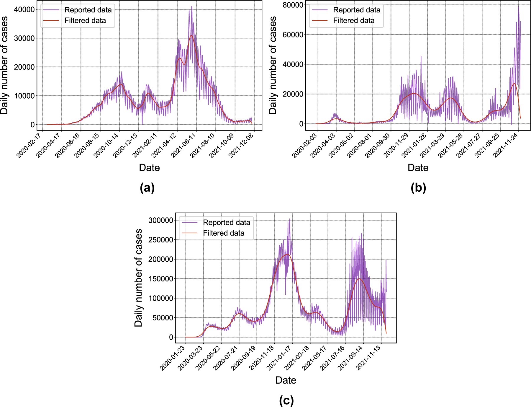
Daily cases, reported (purple) and filtered (red). (a) Argentina, (b) Germany and (c) United States.
Having a smooth curve, detecting maximums and minimums can be done by straightforward methods. It must be remarked that the algorithm is not completely automatic: proper hyperparameter values must be carefully chosen by a human user, and since filtering is not perfect, in some cases human interpretation is necessary to determine which minimums and maximums are “false” and which are not.
In Figure 3 we show the filtered curves corresponding to the daily cases and daily deaths in a single plot in order to compare them. It is interesting to note that the cases and deaths curves have similar shapes, with the deaths curve delayed by a short period (approximately two weeks) as expected due to the length of the infectious period. This also shows that the propagation speed of deaths is directly related to the propagation speed of infections. However, due to the existence of measurement noise, they do not always exhibit the same amount of waves.
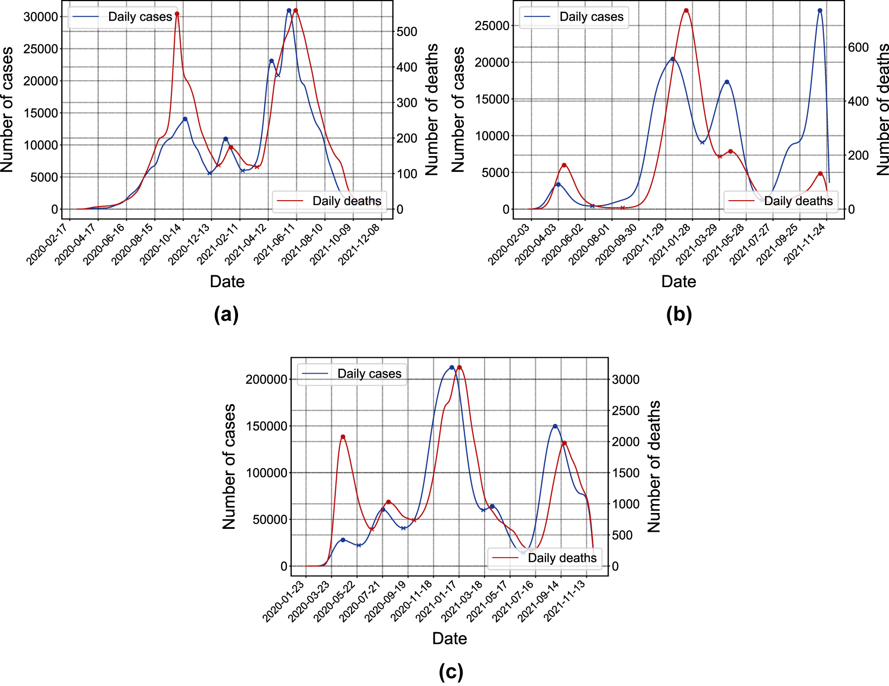
Daily cases (blue, scale shown on the left side axis) and deaths (red, scale shown on the right side axis) filtered curves. Filled circles indicate local maximums; × marks indicate local minimums. (a) Argentina, (b) Germany and (c) United States.
Results
Once the data is properly segmented into stages, the disease’s propagation speed can be assessed by analyzing the evolution over time of the MTBI indicator within each of them. To achieve this, we performed the following procedure:
Step 1: Fix a day T=T 0 to start the procedure.
Step 2: Estimate the model parameters using data from the beginning of the stage and up to T. This yields two estimates
Step 3: Use these estimates on Eq. (4) to obtain
Step 4: Take T=T 0+1 and repeat Steps 2–3.
Step 5: Repeat Step 4 until T is the last day of the stage.
This yields three curves
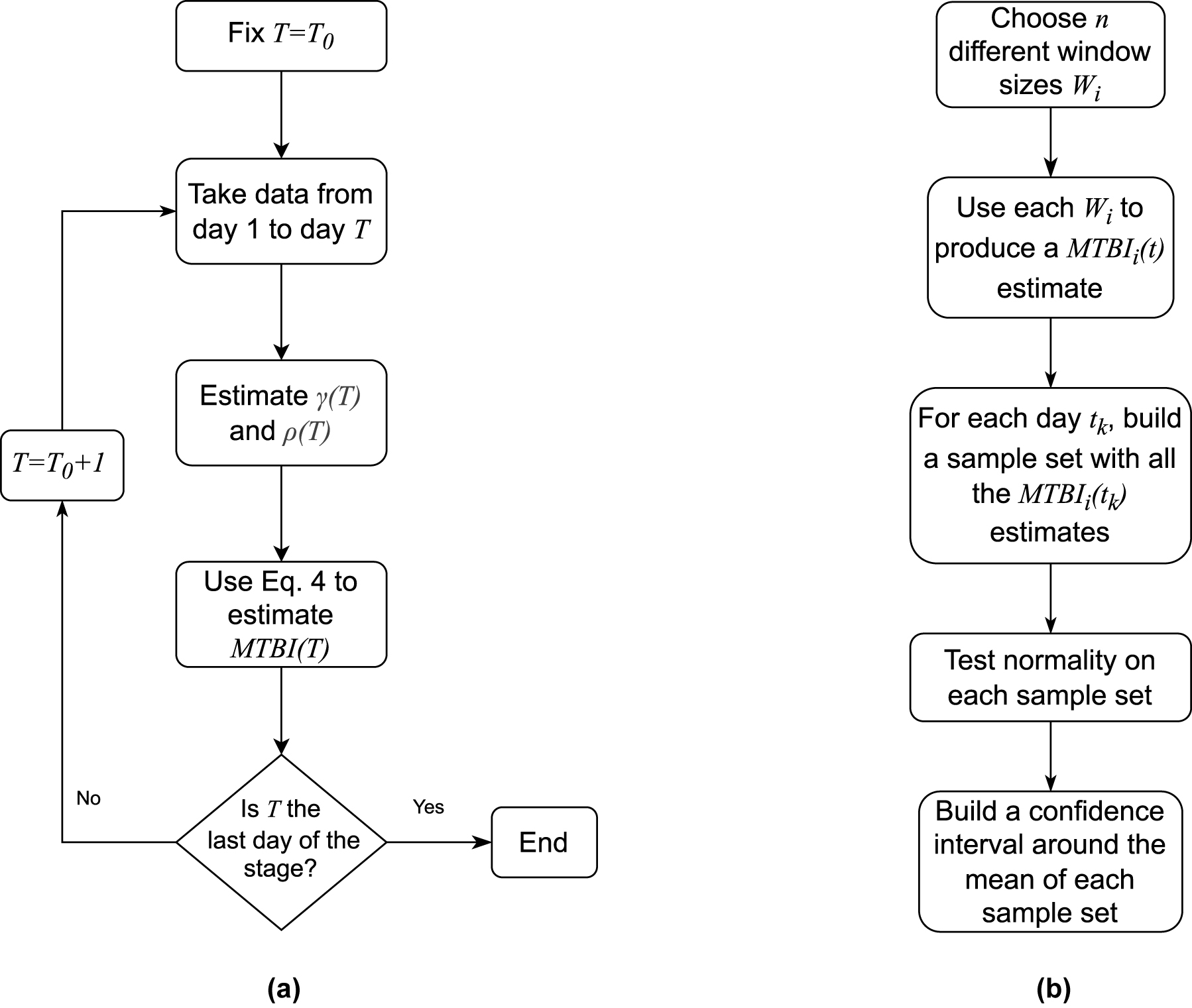
Flow diagrams describing estimation and the statistical test. (a) Procedure to obtain the estimated curves
A natural question arises from this study: is the whole history of a stage significant to estimate the parameters, at any given time instant, or should a shorter time period be considered instead? This matter has already been addressed in the context of the SIR model (Capobianco et al. 2021; Cordelli et al. 2020). Then, we intend to answer how much the parameters
For the analysis, we considered the following study cases:
Argentina: initial stage of the first wave, from March 03, 2020 to October 17, 2020.
Germany: initial stage of the fourth wave, from July 02, 2021 to November 08, 2021.
United States: initial stage of the third wave, from September 07, 2020 to December 30, 2020.
As it can be seen in Figure 5, the obtained

Evolution over time of
Now we turn to the analysis of the MTBI indicator. In contrast to the behaviour of the ρ and γ/ρ parameters, the
Step 1: Choose n different window sizes W i .
Step 2: Compute the
Step 3: For each index (day) t
j
in the curve, form a sample set with every
Step 4: Test normality on each S j .
Step 5: Compute the average
Step 6: Use each S
j
to produce confidence intervals around
This algorithm can be interpreted as follows: produce n different estimators for the MTBI(t) curve and test for normality pointwise. Then, take the average of all the estimator as a ”best guess” of the real MTBI(t) and measure its precision via confidence intervals. The normality of the samples, if achieved, means that observations are disposed around its mean in a Gaussian manner and its differences are mostly due to random estimation noise. Figure 6a shows the results of applying a Kolmogorov-Smirnov test with 0.05 significance level: the green points indicate the indexes (days) where no evidence against normality can be found. The test p-values for the three countries are plotted in Figure 6b. In all three cases there are some days when the test fails (more precisely: 40 out of 185 (21.6%) for Argentina, three out of 86 (3.5%) for Germany and 11 out of 71 (15.5%) for USA), but it is clear than most of the samples can be safely considered normal.

Results of the 95% Kolmogorov-Smirnov normality test applied pointwise to the sample of
The last step is to show that the estimated
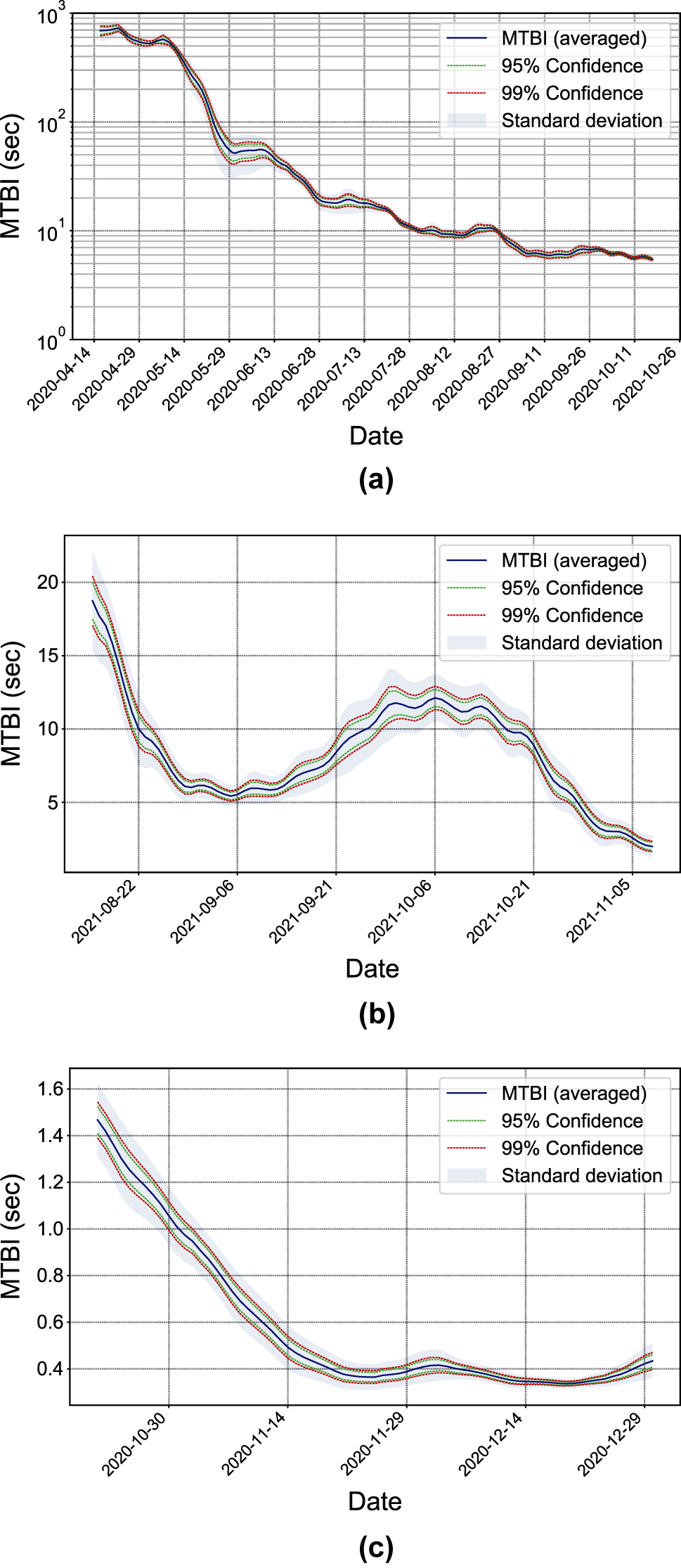
Statistical analysis of
Discussion/conclusions
In this work we have analyzed the evolution over time of the MTBI indicator given by a recently proposed stochastic nonhomogeneous Markov model when applied to the COVID-19 pandemic, which is useful to measure the propagation speed of the epidemic. Three countries were considered as study cases: Argentina, Germany and the United States. For each of these countries, a particular stage was chosen and the model was fitted using different sets of input data. On the one hand, the full history of the stage until the day t was considered to calibrate the model parameters at that day, and on the other hand, the calibration at t was made using only the data from several time windows of different lengths. We show the evolution over time of the averaged MTBI indicator, as well as the evolution of the model parameters. The most important conclusion was that the MTBI indicator (which depends on those parameters) does not change significantly using different sizes of input data, which shows this indicator is robust with respect to the dataset size. Of all the three study cases, only the one from Germany has a vaccination process, rising from 35 to 50% over that period. The consequently sudden slow down in the speed propagation can be seen in the picture. Due to the population size and social mobility (between 20 and 30% under normal) in the considered stage of the United States, the propagation speed is much higher than in the other two study cases, which is reflected in the extremely low numerical values of the MTBI (Figure 7c). In the case of Argentina, the strict lockdown imposed during the first wave of the epidemic is reflected on high
Funding source: Universidad Nacional de Tres de Febrero
Award Identifier / Grant number: 32/19 80120190100010TF
-
Research funding: This work was supported by Universidad Nacional de Tres de Febrero under the grant no. 32/19 80120190100010TF.
-
Author contributions: All authors have accepted responsibility for the entire content of this manuscript and approved its submission.
-
Competing interests: Authors state no conflict of interest.
-
Informed consent: Informed consent was obtained from all individuals included in this study.
-
Ethical approval: The local Institutional Review Board deemed the study exempt from review.
References
Ali, I., and S. U. Khan. 2020. “Analysis of Stochastic Delayed SIRS Model with Exponential Birth and Saturated Incidence Rate.” Chaos, Solitons & Fractals 138: 110008. https://doi.org/10.1016/j.chaos.2020.110008.Search in Google Scholar
Al-Ani, B. G. 2021. “Statistical Modeling of the Novel COVID-19 Epidemic in Iraq.” Epidemiologic Methods 10 (s1): 20200025. https://doi.org/10.1515/em-2020-0025.Search in Google Scholar
Barraza, N. R., G. Pena, and V. Moreno. 2020. “A Non-homogeneous Markov Early Epidemic Growth Dynamics Model. Application to the SARS-CoV-2 Pandemic.” Chaos, Solitons & Fractals 139: 110297. https://doi.org/10.1016/j.chaos.2020.110297.Search in Google Scholar PubMed PubMed Central
Cao, Z., Y. Shi, X. Wen, H. Su, and X. Li. 2020. “Dynamic Behaviors of a Two-Group Stochastic SIRS Epidemic Model with Standard Incidence Rates.” Physica A: Statistical Mechanics and its Applications 554: 124628. https://doi.org/10.1016/j.physa.2020.124628.Search in Google Scholar
Capobianco, G., R. Cobiaga, W. Reartes, and F. Turpaud. 2021. “The SIR Model in the COVID-19 Pandemic.” In VIII Congreso de Matemática Aplicada, Computacional e Industrial, 715–8. La Plata, Argentina: ASAMACI. https://asamaci.org.ar/wp-content/uploads/2021/07/MACI-Vol-8-2021.pdf.Search in Google Scholar
Chowell, G., L. Sattenspiel, S. Bansal, and C. Viboud. 2016. “Mathematical Models to Characterize Early Epidemic Growth: A Review.” Physics of Life Reviews 18: 66–97. https://doi.org/10.1016/j.plrev.2016.07.005.Search in Google Scholar PubMed PubMed Central
Cordelli, E., M. Tortora, R. Sicilia, and P. Soda. 2020. “Time-window SIQR Analysis of COVID-19 Outbreak and Contain Ment Measures in Italy.” In 2020 IEEE 33rd International Symposium on Computer-Based Medical Systems (CBMS), 277–82: IEEE.10.1109/CBMS49503.2020.00059Search in Google Scholar
Cori, A., N. M. Ferguson, C. Fraser, and S. Cauchemez. 2013. “A New Framework and Software to Estimate Time-Varying Reproduction Numbers during Epidemics.” American Journal of Epidemiology 178 (9): 1505–12. https://doi.org/10.1093/aje/kwt133.Search in Google Scholar PubMed PubMed Central
Feller, W. 1991. An Introduction to Probability Theory and its Applications, 1, 3rd ed. Hoboken, NJ, USA: John Wiley & Sons.Search in Google Scholar
Fokas, A. S., N. Dikaios, and G. A. Kastis. 2021. “Covid-19: Predictive Mathematical Formulae for the Number of Deaths during Lockdown and Possible Scenarios for the Post-lockdown Period.” Proceedings of the Royal Society A 477 (2249): 20200745. https://doi.org/10.1098/rspa.2020.0745.Search in Google Scholar PubMed PubMed Central
Ganyani, T., C. Faes, and N. Hens. 2020. “Inference of the Generalized-Growth Model via Maximum Likelihood Estimation: A Reflection on the Impact of Overdispersion.” Journal of Theoretical Biology 484: 110029. https://doi.org/10.1016/j.jtbi.2019.110029.Search in Google Scholar PubMed
Gleeson, J. P., T. Brendan Murphy, J. D. O’Brien, N. Friel, N. Bargary, and D. J. P. O’Sullivan. 2022. “Calibrating COVID-19 Susceptible-Exposed-Infected-Removed Models with Time-Varying Effective Contact Rates.” Philosophical Transactions of the Royal Society A 380 (2214): 20210120. https://doi.org/10.1098/rsta.2021.0120.Search in Google Scholar PubMed PubMed Central
Gomes da Silva, R., M. H. Dal Molin Ribeiro, V. Cocco Mariani, and L. dos Santos Coelho. 2020. “Forecasting Brazilian and American COVID-19 Cases Based on Artificial Intelligence Coupled with Climatic Exogenous Variables.” Chaos, Solitons & Fractals 139: 110027. https://doi.org/10.1016/j.chaos.2020.110027.Search in Google Scholar PubMed PubMed Central
Huang, N. E., F. Qiao, Q. Wang, H. Qian, and K. K. Tung. 2021. “A Model for the Spread of Infectious Diseases Compatible with Case Data.” Proceedings of the Royal Society A 477 (2254): 35153589. https://doi.org/10.1098/rspa.2021.0551.Search in Google Scholar PubMed PubMed Central
Kermack, W. O., and A. G. McKendrick. 1927. “A Contribution to the Mathematical Theory of Epidemics.” Proceedings of the Royal Society of London 115 (772): 700–21.10.1098/rspa.1927.0118Search in Google Scholar
Klugman, S. A., H. H. Panjer, and G. E. Willmot. 2013. Loss Models: Further Topics. Hoboken, NJ, USA: John Wiley & Sons.10.1002/9781118787106Search in Google Scholar
Konno, H. 2010. “On the Exact Solution of a Generalized Pólya Process.” Advances in mathematical physics 2010: 504267. https://doi.org/10.1155/2010/504267.Search in Google Scholar
Liu, Y., Y. Zhang, and Q. Wang. 2020. “A Stochastic SIR Epidemic Model with Lévy Jump and Media Coverage.” In Advances in Difference Equations. 2020: 70.10.1186/s13662-020-2521-6Search in Google Scholar PubMed PubMed Central
Lundberg, O. 1964. On Random Processes and Their Application to Sickness and Accident Statistics. Almqvist & Wiksells Boktryckeri-a.-b. Also available at https://books.google.com.ar/books?id=mr4rAAAAYAAJ.Search in Google Scholar
Moreno, V., G. Pena, and N. R. Barraza. 2021. “Procesos de nacimientos no homogéneos y su aplicación a la pandemia del COVID-19.” In VIII Congreso de Matemática Aplicada, Computacional e Industrial, 711–4. La Plata, Argentina: ASAMACI. Search in Google Scholar
Our World In Data. 2021. Data on COVID-19 (Coronavirus). Also available at https://github.com/owid/covid-19-data/tree/master/public/data (accessed July 29, 2021).Search in Google Scholar
Pena, G. 2021. Epydemics. Also available at https://github.com/GabrielPenaU3F/epydemics/releases/tag/version-1.0.V.1.0.Search in Google Scholar
Pena, G., V. Moreno, and N. R. Barraza. 2022. “Stochastic Modeling of the Mean Time between Software Failures: A Review.” In System Assurances: Modeling and Management, edited by P. Johri, A. Anand, J. Vain, J. Singh, and M. Quasim: Elsevier Science. Emerging Methodologies and Applications in Modelling, Identification and Control. Chap. 20. Also available at https://books.google.com.ar/books?id=q5xBEAAAQBAJ.10.1016/B978-0-323-90240-3.00020-5Search in Google Scholar
Rojas, S. 2020. “Comment on “Estimation of COVID-19 Dynamics “On a Back-Of-Envelope”: Does the Simplest SIR Model Provide Quantitative Parameters and Predictions?” Chaos, Solitons & Fractals: X 5: 100047. https://doi.org/10.1016/j.csfx.2020.100047.Search in Google Scholar
Sendova, K., and L. Minkova. 2019. “Introducing the Non-homogeneous Compound-Birth Process.” Stochastics 92 (5): 814–32, https://doi.org/10.1080/17442508.2019.1666132.Search in Google Scholar
Silva, P. C. L., V. C. B. Paulo, H. S. Lima, M. A. Alves, F. G. Guimara̋es, and R. C. P. Silva. 2020. “COVID-ABS: An Agentbased Model of COVID-19 Epidemic to Simulate Health and Economic Effects of Social Distancing Interventions.” Chaos, Solitons & Fractals 139: 110088. https://doi.org/10.1016/j.chaos.2020.110088.Search in Google Scholar PubMed PubMed Central
Simon, M. 2020. “SIR Epidemics with Stochastic Infectious Periods.” Stochastic Processes and their Applications 130 (7): 4252–74. https://doi.org/10.1016/j.spa.2019.12.003.Search in Google Scholar
Smith, S. W. 2003. “Moving Average Filters.” In Digital Signal Processing, edited by S. W. Smith, 277–84. Boston: Newnes. Chap. 15. Also available at https://www.sciencedirect.com/science/article/pii/B9780750674447500522.10.1016/B978-0-7506-7444-7/50052-2Search in Google Scholar
Stroock, D. W. 2005. “Graduate Texts in Mathematics.” In An Introduction to Markov Processes, 1st ed. vol. 230. Berlin Heidelberg: Springer-Verlag.Search in Google Scholar
Triambak, S., D. P. Mahapatra, N. Mallick, and R. Sahoo. 2021. “A New Logistic Growth Model Applied to COVID-19 Fatality Data.” Epidemics 37: 100515. https://doi.org/10.1016/j.epidem.2021.100515.Search in Google Scholar PubMed PubMed Central
Viboud, C., L. Simonsen, and G. Chowell. 2016. “A Generalized-Growth Model to Characterize the Early Ascending Phase of Infectious Disease Outbreaks.” Epidemics 15: 27–37. https://doi.org/10.1016/j.epidem.2016.01.002.Search in Google Scholar PubMed PubMed Central
Xiong, D., L. Zhang, G. L. Watson, P. Sundin, T. Bufford, J. A. Zoller, J. Shamshoian, M. A. Suchard, and C. M. Ramirez. 2020. “Pseudo-likelihood Based Logistic Regression for Estimating COVID-19 Infection and Case Fatality Rates by Gender, Race, and Age in California.” Epidemics 33: 100418. https://doi.org/10.1016/j.epidem.2020.100418.Search in Google Scholar PubMed PubMed Central
© 2023 Walter de Gruyter GmbH, Berlin/Boston
Articles in the same Issue
- Research Articles
- Outliers in nutrient intake data for U.S. adults: national health and nutrition examination survey 2017–2018
- Using repeated antibody testing to minimize bias in estimates of prevalence and incidence of SARS-CoV-2 infection
- A compartmental model of the COVID-19 pandemic course in Germany
- Energy-efficient model “DenseNet201 based on deep convolutional neural network” using cloud platform for detection of COVID-19 infected patients
- Identification of time delays in COVID-19 data
- A country-specific COVID-19 model
- Incidence and trend of leishmaniasis and its related factors in Golestan province, northeastern Iran: time series analysis
- Application of machine learning tools for feature selection in the identification of prognostic markers in COVID-19
- A study of the impact of policy interventions on daily COVID scenario in India using interrupted time series analysis
- Measuring COVID-19 spreading speed through the mean time between infections indicator
- Performance evaluation of ResNet model for classification of tomato plant disease
- Energy- efficient model “Inception V3 based on deep convolutional neural network” using cloud platform for detection of COVID-19 infected patients