Introducing: De Gruyter Brill Publication Style Guide
Combining the best of both publishing houses, the De Gruyter Brill Publication Style Guide brings together multiple visual elements, including composition, layout, the Brill typeface, and visual hierarchy, to give each publication a distinctive character. Below you can discover sample pages that use the publication style guide.

Harmony meets creativity in our publication style guide, a design system developed to ensure visual consistency across all our publications while still offering room for individual expression.
How This Benefits Your Work
Taking the best elements from De Gruyter, Brill and Brill Germany, the new style guide helps your book to stand out as a De Gruyter Brill publication. Accessibility and flexibility are at the heart of the publication style guide, and thanks to the distinctive Brill typeface, it adapts easily to multiple languages, characters, and subject areas.
The uniformity of the style streamlines the entire typesetting process and ensures consistent quality. It also has the added benefits of leading to more efficient production processes and reliable manufacturing, ensuring your book is produced on time and to the highest standards.
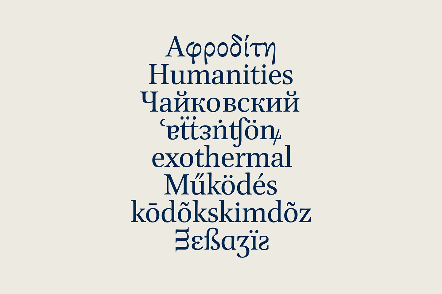
Brill Typeface
Designed for scholars, admired by font lovers, the Brill typeface is known for its harmonization of text across multiple languages and products, from monographs to book series. It is both modern and historic, flexible in its application while tapping into the long history of the publisher. It is, as designer John Hudson put it, a “renaissance style type” that is made especially for scholarly publications.
Take A Look
View samples of the De Gruyter Brill Publication Style Guide in use across subject areas. Download sample pages below.