
Complex topics visually decoded: a multimodal perspective on infographics in knowledge transfer between experts and laypeople
-
Anna Spielvogel


Abstract
Knowledge transfer between experts and laypersons often does not involve the creation of parallel specialist and target texts, but rather of multimodal compositions such as infographics. These visual-dominant formats are designed to improve information transfer by presenting specialized knowledge in a comprehensible manner for a wider audience. This contribution investigates the techniques used to “translate” specialist-coded knowledge into the format of the infographic, placing particular emphasis on the multimodal interplay between different semiotic modes. The present analysis is designed as a case study and draws on a selection of three infographics from the Institut national des sciences de l’Univers (INSU), specifically created for climate change communication in collaboration with the media company Bon Pote.
1 Introduction
In what is often referred to as a “knowledge society,” the knowledge generated within various academic disciplines and its communication to a broader lay audience continue to be of paramount importance. In light of the growing complexity of contemporary societal challenges and the ongoing evolution of media formats, there is a constant development and diversification of knowledge communication practices. Within this broader context, a marked shift toward the visual mode has become increasingly apparent – both in communicative practice and in scholarly research over the past decades (Jewitt 2009; Klug and Stöckl 2016; Kress and van Leeuwen 2001; Ledin and Machin 2020).
Particularly in this context, the infographic has gained increasing relevance as a tool for transferring expert knowledge to lay audiences. With its primarily visual orientation, the infographic not only responds to the public’s demand for more engaging forms of knowledge presentation, but also renders complex content accessible through the structured interplay of diverse visual and textual elements (see for example Martin and Unsworth 2024). Inherent to the infographic – beyond its core function of informing – is its multimodal character: various semiotic modes interact not through fixed roles, but via shared principles that allow them to flexibly encode meaning (cf. Kress and van Leeuwen 2001: 2). Given this capacity to convey complex information, recent research has examined its use in educational contexts (Kerneis and Santini 2015; Martin and Unsworth 2024; Palmucci 2017; Unsworth 2021), in data journalism (Chatenet and Cardoso 2020; Theviot 2020) and as an interactive knowledge format (Weber et al. 2013).
What has received comparatively little attention so far, however, is the question of how formerly expert-coded knowledge is restructured and “translated” in the process of knowledge transfer – specifically in ways that reduce complexity – within the dynamic interplay of semiotic modes. This question constitutes the focus of the present chapter. Following Niederhauser (1999: 117–118), the analysis investigates the specific techniques employed in the process of knowledge transfer and the text-linguistic consequences this has for the infographic as the “product” of this translational process.
The analysis is based on a case study of three online infographics developed by the French Institut national des sciences de l’Univers (INSU) – a renowned scientific institution in France – produced in collaboration with the media platform Bon Pote specifically for public communication on climate change. The analysis material is briefly introduced in the following section, after which the theoretical and methodological foundations of the analysis are outlined. The three infographics are then analyzed with regard to the above-mentioned question.
2 Theoretical background and method
2.1 Analysis material
Given the increasing fragmentation of knowledge within popular science texts, it is often no longer feasible to establish clear-cut source–target text relationships, as references to the original scientific sources are frequently absent or only vaguely indicated. In light of this methodological challenge, the present study centers on climate change communication. This focus not only reflects a pressing and socially relevant contemporary issue, but also offers a key analytical advantage: the availability of a prominent international reference institution, the Intergovernmental Panel on Climate Change (IPCC). The IPCC provides terminology-bound knowledge in the form of comprehensive glossaries and precise explanations (e.g. GIEC 2021), which enabled a systematic identification and validation of the specialized knowledge embedded in the infographics prior to the analysis, as well as its classification within established scientific concepts and knowledge frameworks.
The infographics selected as examples for this analysis were published by the Institut national des sciences de l’Univers (INSU), a renowned French research institution that conducts research in the field of climate science, among others (cf. INSU 2022a). The INSU operates under the authority of the French national research institution Centre national de la recherche scientifique (CNRS), which is actively involved in science communication in order to prevent the spread of misinformation (cf. INSU 2022b).
Motivated by this aim, a collaboration in 2021 between the media platform and blogger Bon Pote[1] and the graphic design agency Méduse Communication resulted in the production of 20 infographics, which were published in a section on the website of the INSU. These infographics were specifically designed to counter widespread misconceptions about climate change within the French public sphere. As such, they provide a valuable basis for analysis, as they explicitly target a broader, non-specialist audience, build on clearly defined scientific terminology, and thereby exemplify the process through which expert scientific knowledge is transformed into a general-language, visually supported mode of public discourse.
For the analysis, three infographics (see Figure 1) were selected as examples: Le climat a-t-il vraiment toujours changé? [ʻHas the climate really always changed?ʼ] (I1), published on February 25, 2021; CO 2 & changement climatique [ʻCO 2 & climate changeʼ] (I2), published on March 18, 2021; and Météo & climat, comment ne plus les confondre? [ʻWeather & climate, how to avoid confusing them?ʼ] (I3), published on April 22, 2021.[2] These infographics were chosen based on their thematic focus, as they address core concepts of climate change and articulate fundamental distinctions relevant to public debate – such as the difference between weather and climate or between natural and anthropogenic causes of climate change. In addition, the infographics display a high degree of structural and conceptual similarity, allowing for comparative insights into the underlying techniques of knowledge transfer and the interplay of various modes involved in communicating scientific knowledge to the public.
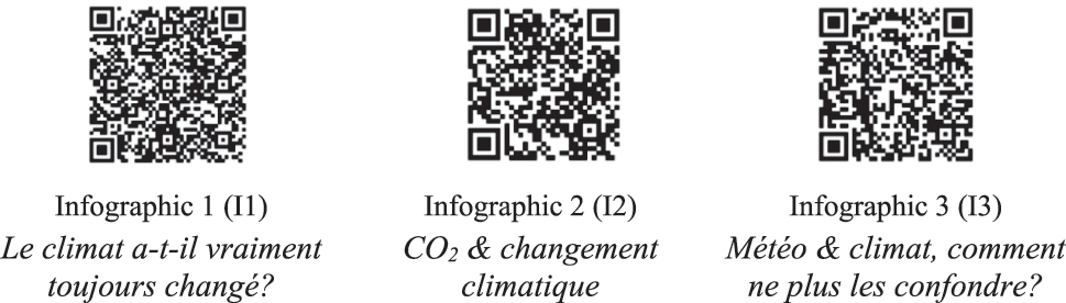
QR codes directing to the infographics examined in the analysis.
2.2 Infographics in the context of multimodal communication
The genre of the infographic originated in the field of data visualization, which explains its primary emphasis on the visual mode. Initially, infographics were mainly used to present complex datasets in a simplified and accessible manner. Over time, however, the format evolved into an integrative medium that combines multiple modes of communication (for a historical account of the infographic, see Dick 2020).
The communication of knowledge in infographics takes place through the interaction of various semiotic resources, referred to as modes (cf. Kress and van Leeuwen 2001: 2). Bateman et al. (2017: 289) define infographics as a “composite semiotic mode that integrates contributions from other semiotic modes.ˮ They also emphasize that these modes cannot be reduced to sensory channels or conceived as fixed, clearly delineated units. Rather, modes must be examined in relation to their specific communicative contexts (cf. Bateman et al. 2017: 17–19).[3] According to Stöckl, text-specific combinations of intermodal relations – such as additive, complementary, hierarchical, divergent, or conflictive – can be identified depending on the communicative product’s form and the author’s intention (cf. Stöckl 2006: 28). Furthermore, a particular feature of the infographic is its ability to incorporate more ‘traditional’ forms of information visualization – such as diagrams, timelines, tables, and charts – together with textual elements into a coherent multimodal text. In this regard, Peschke (2019) functionally categorizes the visual resources of infographics into four main types, which – following Bateman et al. (2017) – can be understood as specified forms of expression within the visual mode: images (high iconicity), schematic images (abstract representations), logical images (relational representations) and visual analogies (with metaphorical references) (cf. Peschke 2019: 78–116). This classification will guide the subsequent analysis.
A few words also need to be said about the spatial organization of information in infographics: they are particularly characterized by a high density of information while maintaining a deliberately limited length. Following standard design guidelines, it is recommended that infographics span no more than one or two pages to ensure clarity and user-friendliness (cf. Dunlap and Lowenthal 2016: 55). This information density is mitigated through a modular arrangement, where thematically and graphically distinct units replace traditional long text (cf. Schröder 2010: 181). This modular structure results in a non-linear information consumption, called “delinearization” (Bucher 2011: 125), which is closely tied to the concept of multimodality. This allows for a flexible, user-centered approach to accessing information, enabling users to navigate the individual modules in a non-sequential manner.
To facilitate the subsequent analysis of the examples in relation to the research question, Stöckl’s model of multimodal text type analysis is adopted as a guiding framework. This model emphasizes several analytical dimensions: structure and delimitation, actional and thematic structure, multimodal interconnections, and intertextuality (cf. Stöckl 2016: 22–25). First, Stöckl suggests an examination of (1) structure and demarcation – that is, the visual organization, spatial segmentation, and formal separation or arrangement of the various semiotic resources. This is followed by an analysis of the infographic’s (2) thematic structure and (3) action structure, which also includes its communicative orientation (informative, appellative, argumentative, or narrative). The next step involves analyzing (4) the multimodal connections and interrelations between the involved semiotic modes. Finally, (5) intertextuality is examined, which in this analysis is approached primarily through the identification of semantic isotopies.
2.3 Infographics in knowledge transfer between experts and laypersons
Next is a brief overview of the technical language features that become relevant when analyzing knowledge transfer with the help of infographics, as the primary cause of the difficulties in knowledge transfer lies in the peculiarities of the technical language used in intra-specialist communication. Specialist languages are defined here as „Erscheinungsformen der Sprache, die zur begrifflichen Erfassung und zur Darstellung fachspezifischer Sachverhalte und Gegenstände sowie zur Verständigung über diese Sachverhalte und Gegenstände […] dienen“ [ʻmanifestations of language that serve to conceptualize and represent subject-specific facts and objects, as well as to communicate about these facts and objectsʼ] (Niederhauser 1999: 23–24). These languages are used whenever absolute precision is essential in specialist discussions between experts (cf. Atayan et al. 2015: 412). The most prominent feature, and one of particular importance for knowledge transfer, is the specialized lexicon found in technical texts. A technical term is defined as „die kleinste bedeutungstragende und zugleich frei verwendbare sprachliche Einheit eines fachlichen Sprachsystems […]“ [ʻthe smallest meaning-bearing and at the same time freely usable linguistic unit of a technical language systemʼ] (Roelcke 2010: 56), and it is intrinsically linked to the specialized knowledge of a given discipline (cf. Jahr 2009: 84). Functionally, technical terms facilitate efficient communication among experts within the same field by possessing certain characteristic features, such as subject-relatedness, clear definition, systematicity, precision, unambiguity, and referentiality (cf. Kalverkämper 1988: 166).
For the transfer of knowledge between experts and laypeople, the popularization of content is commonly employed. This refers to “the transformation of specialized knowledge into ‘everyday’ or ‘lay’ knowledge, as well as a recontextualization of scientific discourse, for instance, in the realm of the public discourses of the mass media or other institutions” (Calsamiglia and van Dijk 2004: 370). The central goal of popularization is to make the state of scientific research and its current findings accessible to audiences outside the expert community, thereby fostering their interest through accessible and concise texts (cf. Reinart and Pöckl 2015: 144). Although it has become increasingly common in recent years for scientists to act as agents of popularization themselves, the present case reflects a more traditional division of labor, characterized by clearly separated roles between experts and popularizers (cf. Reinart and Pöckl 2015: 145–146). In the specific examples analyzed, the experts of the INSU are not directly involved in the dissemination of their findings; instead, this task is delegated to professional popularizers, namely Bon Pote and Méduse Communication. Particularly within this collaborative constellation, it becomes clear that the dichotomy between experts and non-experts – often treated as a given – must instead be understood as something actively constructed. Formats such as infographics play a key role in shaping and negotiating these epistemic roles. As Visser (2018: 98) argues, epistemic positions are not simply assumed but are discursively produced. Knowledge transfer, then, is not merely a matter of transmitting information; it is also a process through which epistemic roles are assigned, negotiated, and stabilized.
When knowledge is transferred from an original text to a target text, almost all linguistic features of the original text type are altered and not directly reproduced. Since conventions of specialist texts are typically unfamiliar to the lay audience, the popularizer is not bound by these conventions and can adapt the form of communication to the needs of the target audience (cf. Niederhauser 1997: 115–116). As a result, it is not uncommon for the original text to be transformed into an entirely new text type – such as a descriptive, explanatory, argumentative, or narrative focus (cf. Brinker et al. 2024: 63). In terms of content, this results in textual modifications and a simplification of the popularized material (cf. Reinart and Pöckl 2015: 148).
Overall, the transfer of knowledge between experts and laypeople is not a straightforward, linear process of information transmission. Rather, knowledge is modified, restructured, and tailored to the specific context of the transfer (cf. Beckers 2012: 96–97). Since knowledge can exist in various forms and is inherently dynamic (cf. Polanyi 2009; Tulving 1972; Weber 2009), when a transfer process is initiated, the knowledge is reorganized or adapted to the knowledge structures, as well as the motivational and cognitive prerequisites of the recipients (cf. Antos 2001: 26). Therefore, whenever the term “knowledge transfer” is used in the following, it always carries this dimension of meaning.
3 Analysis and results
3.1 The multimodal structure
The analysis of the infographics reveals the following macro-structural elements: each infographic is hierarchically organized, featuring a title and, optionally, a subtitle. These are followed by individual modules comprising text-image combinations, each introduced by a subheading. The number of modules within the main body of the infographic varies but is always greater than one (I1, I2, I3). The modules are visually unified, distinguished only by their respective subheadings, and adhere to a linear reading flow, proceeding from left to right and top to bottom. This sequential arrangement ensures that the topic or question presented in the title is fully comprehensible only when the prescribed reading order is followed. Consequently, the structure of the infographics exhibits a high degree of definition, allowing little flexibility in the order of reception.
The color scheme is dominated by black, light blue, pink, and yellow. Text elements are predominantly rendered in black, while the title appears in pink with a black shadow. The subheadings are highlighted by a yellow shadow. Additional text highlights are marked in light blue or yellow. The visual illustrations align with this color scheme, combining black, light blue, yellow, and pink to achieve a harmonious and consistent design. Stylistically, the infographics draw inspiration from sketch notes, characterized by handwritten-style typography, text highlights resembling highlighter usage, and simple illustrations. This design choice evokes the impression of hand-annotated text. However, unlike traditional sketch notes, which are typically created for personal use (cf. Dimeo 2016: 10), the classification of these infographics as a specific text format can be derived primarily from their public media dissemination through the INSU.
The carefully designed multimodal composition, integrating verbal and non-verbal elements, enhances coherence and enables readers to perceive the infographics as cohesive and unified formats. The macrostructure of the infographics does not mirror a scientific text in a one-to-one manner; instead, it is adapted to meet the needs of the target audience and simplified significantly. This adaptation involves the reorganization and reconfiguration of information, with the degree of detail deliberately adjusted. This reduction of complexity is a defining feature of the popularization of scientific content, as evident in the altered macrostructure (cf. Niederhauser 1999: 120–121).
The identification of a clearly defined target audience must remain open at this point, due to a lack of explicit indications from the INSU. However, the thematic focus on countering misconceptions and myths surrounding climate change suggests that the infographics are intended to address a broad and heterogeneous audience. This intention is further supported by the structural organization of the infographics, which aims to maximize reach and communicative accessibility while simultaneously reducing complexity.
3.2 Actional and thematic structure
Building upon the identification of multimodal elements that define the typical form of infographics, this section examines the actional and thematic structure of the individual infographics. In all instances, the discrete actions – referred to as “stages” by Stöckl (2016: 26) – are manifested across various modalities. Given the constraints of this paper, a comprehensive enumeration of every element contributing to the actional structure is impractical; therefore, only the most salient components will be mentioned below.
For instance, the headline serves to announce the thematic orientation of the infographic:
| Le climat, a-t-il vraiment toujours changé? (I1) |
| [ʻHas the climate really always changed?ʼ] |
| CO 2 & changement climatique (I2) |
| [ʻCO 2 & climate changeʼ] |
| Météo & climat, comment ne plus les confondre? (I3) |
| [ʻWeather & climate, how to avoid confusion?ʼ] |
The following subheadings of the individual sections and modules indicate the specific thematic focus of the individual modules. This could look as follows, as an example for I1:
| Que sait-on du climat passé? […] |
| Comment reconstitue-t-on le climat du passé? […] |
| Comment explique-t-on les différents changements climatiques? […] |
| Des facteurs naturels peuvent-ils expliquer les changements climatiques actuels? […] |
| Le mot de la fin […] (I1) |
| [ʻWhat do we know about past climate? […] |
| How can we reconstruct past climate? […] |
| How can we explain different climate changes? […] |
| Can natural factors explain current climate change? […] |
| The final word […]ʼ] |
The last subheading in (4), titled Le mot de la fin [ʻThe final wordʼ], introduces the concluding remarks, and is further emphasized by a black line at the end, signaling the infographic’s closure. In the analyzed infographics, modules corresponding to these subheadings predominantly present an explicative development of the announced topics. Accompanying images and illustrations serve to illustrate, explain, narrate, and occasionally evaluate or comment on the content. For instance, in I3, various semiotic resources (for a detailed discussion of intermodal relations, see Section 3.3.2) such as thermometers and weather pictograms are used to visually represent abstract concepts like “climate” and “weather”. Stylized scales add explanatory depth to these concepts, while comic-style figures not only introduce a narrative dimension but also serve to comment on or evaluate the content through their association with verbal elements (e.g. I2, I3).
From a structural perspective, some multimodal elements are intended to direct the reader’s attention to specific sections, highlight particular content, and encourage engagement. For example, in I3, within the module titled Climat et météo: de quoi parlons-nous? [ʻClimate and weather: what are we talking about?ʼ], key definitions are enclosed in pink boxes, underscoring their significance. These salience markers are always located in the modality of the image and represent one of the strengths of infographics. They guide the audience’s focus according to salience principles (see e.g., Itti and Koch 2000: 1501–1502) during the reception process, thereby facilitating successful knowledge transfer. The actual effectiveness of this technique – as in other instances – cannot be assessed at this point, as such an evaluation would necessitate a reception-oriented approach beyond the scope of the current analysis.
Thus, the infographics present a „spezifische Matrix funktionaler Abschnitte“ [ʻspecific matrix of functional sectionsʼ] (Stöckl 2016: 26). Regarding the thematic structure, the infographics predominantly exhibit an explicative thematic development, in line with their function of conveying information. However, they may also incorporate narrative and argumentative elements. The explicative development primarily occurs through a complementary integration of text and image modalities to clarify concepts and terms (further discussed in the following chapter). In this context, the explanandum is realized thematically through the title or subheading, while the explanans is conveyed through the text-image relations within the corresponding module.
An analysis of the actional and thematic structure reveals that these are “integrative” across the different modes (see also Stöckl 2016: 22), and that the individual modules of the infographics are realized by linking the modes of text and image. Additionally, the structural elements indicate that the text has transitioned away from its original scientific nature (cf. Hepp 2022: 46). In choosing the appropriate format for the popularized content, this signifies a shift in text type – specifically, the adaptation of the original specialized text into the infographic format in response to the altered communication context. The mode of communication has shifted from intra- or interdisciplinary exchange to a clearly vertical structure, mediated by the popularizing agents Bon Pote and Méduse Communication, who operate at the interface between scientific expertise and public discourse.
3.3 Explication of specialist knowledge
Specialist knowledge plays a crucial role in climate communication, particularly through the use of the specialized lexicon of climate science. Popularizers commonly employ various techniques to make expert knowledge accessible to lay audiences. The following analysis initially focuses on the purely verbal level and is later expanded to address intersemiotic relationships between modalities, as discussed in the next chapter.
3.3.1 Textual mode: short definitions, implicit explanations, paraphrased omissions, and unexplained technical terms
The most clearly identifiable technique employed by popularizers to make the knowledge embedded in technical terms explicitly accessible is the use of short definitions. This involves explaining a technical term either cataphorically or anaphorically in a concise sentence (cf. Kalverkämper 1987: 42–44). Consider the following examples:
| Météo: C’est l’étude des phénomènes atmosphériques pour prévoir le temps. |
| C’est le temps qu’il fait à un moment et un endroit donnés, susceptible de changer d’une heure ou d’un jour à l’autre. (I3) |
| [ʻWeather forecasting: The study of atmospheric phenomena to predict the weather. |
| It is the weather at a given time and place, likely to change from one hour or day to the next.ʼ] |
| Climat: C’est l’étude des statistiques de variables atmosphériques sur une longue période de temps (30 ans par convention). |
| C’est le temps auquel on peut s’attendre, pour une région donnée. (I3) |
| [ʻClimate: This is the study of the statistics of atmospheric variables over a long period of time (30 years by convention). |
| It is the weather that can be expected for a given region.ʼ] |
Both (5) and (6) illustrate anaphoric short definitions, in which the technical terms météo [ʻweatherʼ] and climat [ʻclimateʼ] are introduced and explained through backreference, referring to the term previously introduced by the presentative c’est + noun.
Another example of the use of short definitions is found in the following instances:
| Quand une trop grande quantité de CO 2 est absorbée par l’océan, le pH de l’eau diminue, c’est ce que l’on appelle l’acidification des océans. Elle entraîne une malformation et une dissolution des coquilles et squelettes d’organismes. (I2) |
| [ʻWhen too much CO 2 is absorbed by the ocean, the pH of the water decreases – this is known as ocean acidification. This leads to malformation and dissolution of organisms’ shells and skeletons.ʼ] |
| Le CO 2 stimule la croissance des végétaux, on appelle ça le verdissement … (I2) |
| [ʻCO 2 stimulates plant growth, known as greening…ʼ] |
In both examples, these are cataphoric short definitions, where a brief explanation is given first, followed by the introduction of the technical term. The metalinguistic markers ce que l’on appelle [ʻwhat we callʼ] and on appelle ça [ʻwe call itʼ] immediately signal to the recipient that the term that follows will be a technical one, drawing attention to it in a targeted manner (cf. Niederhauser 1999: 145). Additionally, (7) demonstrates an interweaving of cataphoric and anaphoric explanations, as the pronoun elle [ʻsheʼ] refers back to the technical term, followed by a further explanatory sentence that emphasizes the effects and consequences of ocean acidification. The function of these short definitions is to present implicit expert knowledge as explicit factual information, briefly and concisely, thereby establishing a foundation for understanding particularly important terms within the text.
Technical terms can be defined not only explicitly but also explained in an unfolding manner (cf. Niederhauser 1999: 150) – that is, at various points throughout the text. This technique is also employed, as illustrated in the following example:
| Par le passé, la terre a connu un climat bien plus chaud que le climat actuel … comment les scientifiques peuvent-ils donc affirmer avec certitude que le changement actuel est dû aux activités humaines? |
| Que sait-on du climat du passé? |
| Depuis 600 millions d’années, le climat moyen mondial a été plus chaud d’une dizaine de degrés que le climat actuel. Au cours des deux derniers millions d’années, le climat a globalement été moins chaud et la terre a connu une alternance de périodes glaciaires et interglaciaires. La dernière glaciation s’est achevée il y a environ 12000 ans: moment de la sédentarisation de l’homme. |
| Depuis le 19e siècle, nous observons un réchauffement global. La période 1983–2012 a probablement été la plus chaude depuis 1400 ans. […] |
| L’alternance de grandes périodes glaciaires/interglaciaires est en grande partie causée par une variation de la quantité d’énergie solaire reçue. Ces variations proviennent de 5 paramètres: l’orientation et l’inclinaison de l’axe terrestre, l’activité solaire, les variations des formes de l’orbite et de l’ellipse terrestre. […] |
| Les facteurs naturels sont la cause d’un climat plus chaud dans le passé. Cependant, ces derniers n’ont eu qu’un impact modeste sur le climat durant l’holocène (de -12000 ans à nos jours). De nos jours, les facteurs naturels n’expliquent en aucun cas l’évolution si rapide des conditions climatiques. […] (I1) |
| [ʻIn the past, the Earth’s climate was much warmer than it is today… so how can scientists say with certainty that the current change is due to human activity? |
| What do we know about the climate of the past? |
| Over the past 600 million years, the average global climate has been about ten degrees warmer than today’s climate. Over the last two million years, the climate has been cooler overall, with alternating glacial and interglacial periods. The last ice age came to an end around 12,000 years ago, when man became sedentary. |
| Global warming has been observed since the 19th century. The 1983–2012 period was probably the warmest in 1400 years. […] |
| The alternation of major ice ages and interglacial periods is largely caused by variations in the amount of solar energy received. These variations stem from 5 parameters: the orientation and inclination of the Earth’s axis, solar activity, variations in the shape of the Earth’s orbit and ellipse. […] |
| Natural factors are the cause of a warmer climate in the past. However, they have had only a modest impact on climate during the Holocene (from 12,000 years ago to the present day). Today, natural factors in no way explain why climatic conditions have changed so rapidly. […]ʼ] |
In this case, the unfolding definition of changement climatique [ʻclimate changeʼ] becomes apparent; it is explained at several points in the text (indicated in (9) through underlining). Initially, it is explained that the climate has changed repeatedly over the centuries and millennia due to natural factors, and it is only through human greenhouse gas emissions that the warming of the earth’s atmosphere has accelerated significantly. This example also demonstrates that the density of information typically found in a scientific definition is reduced, with additional illustrations and examples employed to present the term’s meaning more comprehensively and to facilitate understanding for the recipient. This approach aligns with Niederhauser’s findings, which highlight that such an implicit technique avoids overly rigid definitions and does not unnecessarily disrupt the flow of the text (cf. Niederhauser 1999: 151).
A series of unfolding definitions can be identified within the infographics, such as those for the terms projections [ʻprojectionsʼ] and prédictions [ʻpredictionsʼ] (I3), as well as CO 2 (I2). This characterizes the approach as a common technique for term explication in the infographics. At the same time, this technique not only conveys isolated knowledge, as in the case of short definitions, but also communicates structural knowledge that extends beyond isolated factual information by embedding it within a broader context.[4]
Additionally, there are techniques in which terms are paraphrased or omitted to reduce the density of technical terms in the text (cf. Niederhauser 1999: 153). The following example illustrates this technique:
| Le moteur du climat est le rayonnement solaire qui parvient jusqu’à la terre. Normalement, il existe un équilibre entre le rayonnement solaire absorbé par la terre et l’énergie thermique qu’elle restitue dans l’espace. (I1) |
| [ʻThe driving force behind climate is solar radiation reaching the earth. Normally, there is a balance between the solar radiation absorbed by the earth and the thermal energy it radiates back into space.ʼ] |
In (10), the term énergie thermique [ʻthermal energyʼ] is used instead of the technically correct “rayonnement thermique infrarouge” [ʻthermal infrared radiationʼ] or “rayonnement terrestre” [ʻterrestrial radiationʼ] (cf. GIEC 2021: 275). Elsewhere, the term énergie restituée [ʻrestored energyʼ] is used (I1, I2). This shows that similar-sounding terms are used for descriptive omissions, which seem to express the same meaning on the surface. However, the question must also be raised as to how successful the paraphrases in the above example are, as many substitute terms hardly seem any more comprehensible than the correct technical term. This illustrates congruently with Tschauder’s (1993: 170) remarks that the transfer of terminology is not necessarily oriented towards the standards of the specialist lexicon and that “pseudo-terms” can thus be formed. This can – especially in the case of an unsystematic transfer of knowledge mediated by the media – lead to an increased use of technical terms in everyday language (cf. Jung 2001: 283–285), in which the terms no longer correspond to the standards and quality criteria of the technical languages. Overall, however, there are few examples of paraphrased omission in the analyzed infographics. This is probably due to the relative brevity of them, as such paraphrased definitions are usually used in longer popular science magazine articles (cf. Niederhauser 1999: 153–154).
The analyzed infographics also contain numerous unexplained technical terms, such as aérosols [ʻaerosolsʼ] (I1), périodes glaciaires et interglaciaires [ʻglacial and interglacial periodsʼ] (I1), puits de carbone naturels [ʻnatural carbon sinksʼ] (I2), les isotopes des paléosols [ʻpaleosol isotopesʼ] (I2), le pH de l’eau [ʻwater pHʼ] (I2), and température moyenne du globe [ʻaverage global temperatureʼ] (I3). Many of these terms are at least somewhat comprehensible due to their surface structure; for instance, température moyenne du globe [ʻaverage global temperatureʼ] can be inferred from the words température [ʻtemperatureʼ] and moyenne [ʻaverageʼ], indicating that it refers to the average temperature. However, it is more challenging for the reader to understand that the addition of du globe [ʻglobalʼ] refers to the global average of near-surface air temperatures over land and sea ice together with sea surface temperatures in ice-free ocean areas (cf. GIEC 2021: 281).[5] This is likely not a barrier to understanding, which is why a detailed definition is not provided. Similarly, the term périodes glaciaires et interglaciaires [ʻglacial and interglacial periodsʼ] is likely to be easily understood by the recipient. A term such as le pH de l’eau [ʻwater pHʼ] can probably also be inferred from basic school education. However, terms like les isotopes des paléosols [ʻpaleosol isotopesʼ] or puits de carbone naturels [ʻnatural carbon sinksʼ] are more complex, as their meanings may be more difficult to deduce, potentially hindering the reader’s understanding of the text.
3.3.2 Visual mode and intersemiosis
3.3.2.1 Images
The next step of the analysis will focus on the methods of visual illustration, with the aim of analyzing how different types of visual illustration are employed and how they interact with the textual modality. In line with Peschke’s typology (2019: 78–116, see also Section 2.2), this analysis will consider the four visual resources of images, schematic images, logical images, and visual analogies.
All three infographics utilize images in the transfer of knowledge about climate change. They include a variety of images, such as suns, snowflakes, and tents (I1), thermometers (I1, I2, I3), plants (I2), people and animals (I2, I3), among others. In all the infographics, the illustrations are designed to resemble the object as closely as possible, relying on a high degree of iconicity combined with abstraction. This abstraction allows the viewer to grasp the essence of the concept without being overwhelmed by extraneous details, thereby facilitating comprehension (cf. Peschke 2019: 78–79). Given the salience of these images in each infographic, it can be assumed that they are initially recognized by the recipient as meaningful elements.
What all the aforementioned images share is that they do not exist in isolation; rather, an accompanying verbal text is placed nearby, suggesting a visual and conceptual interdependency that promotes mutual comprehension. Only through the textual modality can the recipient accurately interpret the precise meaning of the image in a subsequent step. At the same time, the image is embedded within a specific reading framework that departs significantly from everyday language use, guiding the recipient toward a controlled and scientifically framed interpretation. For instance, the image of the sun and snowflakes appears near the verbal text referring to périodes glaciaires et interglaciaires [ʻglacial and interglacial periodsʼ] (I1), while the images of tents are positioned near the technical term sédentarisation de l’homme [ʻsedentismʼ] (I1). These images operate on a symbolic relationship between designans and designatum rather than an iconic level, as they do not directly depict the referenced scientific phenomena. By drawing on established associations (sun = warmth; snowflake = cold; tent = sedentism), the images acquire their specific meaning only in conjunction with the accompanying text. Through this multimodal linkage, the visuals function as deliberate resources that serve as cognitive bridges, supporting the reader’s understanding of the textual content. A similar principle can be observed in the technical terms puits de carbone naturels [ʻnatural carbon sinksʼ] and les isotopes des paléosols [ʻpaleosol isotopesʼ] (I2). The former is accompanied by stylized depictions of soil, water, and vegetation, supplemented by metatextual labels identifying each element. The latter is illustrated by a close-up view of soil layers under a magnifying glass, combined with an arrow and the caption millions d’années [ʻmillion yearsʼ]. These visual cues make it clear that puits de carbone naturels [ʻnatural carbon sinksʼ] refers to natural reservoirs for atmospheric carbon, while isotopes des paléosols [ʻpaleosol isotopesʼ] are represented as geochemical climate archives derived from fossil soils, enabling insights into climatic conditions millions of years ago. Thus, the interaction between the two modalities is complementary, with the image illustrating the verbal text and conveying knowledge about the technical term and its meaning. As a result, the technical term does not need to be explicitly defined in text, reducing the textual burden on the infographic. Returning to the unexplained technical terms discussed in the previous chapter, their lack of explanation in the verbal text seemed problematic at least in part. However, the extended analysis of the visual elements as shown now demonstrates that the understanding of these technical terms can be conveyed through the accompanying images, thereby allowing the image to complement the text.
In some cases, text-image redundancies occur when the images do not initially provide additional layers of meaning to the verbal text but instead merely serve to illustrate a fact. This is evident in I2, for instance, where the corresponding images are placed next to the respective terms, such as océans [ʻoceansʼ] next to an image of waves, végétation [ʻvegetationʼ] next to a tree, and sols [ʻsoilsʼ] next to an image of soil. These images are highly stylized, with high iconicity and simultaneous abstraction, placing them close to pictograms, a subcategory of images (cf. Peschke 2019: 93). While they do not introduce new semantic content, their spatial proximity to the text clearly establishes a multimodal association. Therefore, the images often offer an extended dimension of information in a second step on closer inspection. For example, the aforementioned term puits de carbone naturels [ʻnatural carbon sinksʼ] (I2) from the previous chapter remained undefined initially, but the term is placed in proximity to the text-image-redundant illustrations. This allows readers to infer that these images serve as exemplary representations, which can aid in deducing the possible meaning of the term. While the connection between text and image may not be immediately apparent, it is nonetheless evident that the images in various examples contribute to the formation of initial hypotheses of understanding.
3.3.2.2 Schematic images
The use of schematic images is examined next. In most cases, images are overlaid with schematic elements, as seen in the illustrations of the greenhouse gas effect in I1 and I2. In both diagrams, the depiction of the earth surrounded by the atmosphere is presented in a relatively abstract manner. Given the low iconicity of these images, they are inherently ambiguous, and their meaning can only be inferred from the accompanying textual captions. In both examples, the terms terre [ʻearthʼ] and atmosphère [ʻatmosphereʼ] are used to label the respective graphic elements. The scheme also includes an image of the sun positioned above the earth, with the sun’s rays reaching the earth represented schematically by yellow arrows. The energy that is not absorbed by the earth and remains in the atmosphere is symbolized in both diagrams by purple arrows. The line delimiting the atmosphere indicates that energy cannot escape the atmosphere or can only do so partially. Since the underlying physical processes are highly complex and the phenomenon is invisible to the human eye, the use of schematic elements is essential at this point. The arrows, representing energy, thus have low iconicity. The choice of yellow for the sun’s rays specifically evokes associations with warmth and energy, while the purple arrows do not convey such associations. Instead, the color difference suggests that they represent a different type of energy, labeled in I2 as énergie absorbée [ʻenergy absorbedʼ] and énergie restituée [ʻenergy restoredʼ]. Despite the verbal reference to the effet de serre [ʻgreenhouse effectʼ], the graphic is difficult or even impossible to interpret without the accompanying texts. Therefore, the following textual explanations are provided alongside the diagrams:
| Le climat de la terre résulte d’un équilibre entre l’énergie qu’elle absorbe et celle qu’elle restitue. Tout élément qui perturbe cet équilibre (un excédent de gaz à effet de serre par exemple, comme le CO 2 ) affecte la température car la planète ne peut pas évacuer le surplus d’énergie autrement qu’en modifiant sa température. (I2) |
| [ʻThe earth’s climate is the result of a balance between the energy it absorbs and the energy it releases. Any element that disturbs this balance (an excess of greenhouse gases, such as CO 2 ) affects temperature, as the planet cannot evacuate excess energy except by changing its temperature.ʼ] |
The terminology used in the example refers to the schematic representation and thus provides an additional offer of interpretation or explanation for the reader. The modality of text and image therefore complement each other – just as discussed in the previous chapter on images – reciprocally in understanding and make an invisible phenomenon – the greenhouse gas effect – visible through the mix of image and schematic image. The diagram is accompanied by the metatextual comment schéma très simplifié [ʻhighly simplified diagramʼ], which implicitly alerts the viewer to the reduced complexity of the representation. By signaling this epistemic stance, the infographic immediately establishes transparency regarding the degree of simplification. At the same time, this reveals the didactic orientation of the module and contributes to fostering a relationship of trust with the target audience. Overall, the diagram functions as a “Trägerobjekt” [ʻcarrier objectʼ] of knowledge, imbued with complex meaning related to the physical processes of climate change (Peschke 2019: 81).
3.3.2.3 Logical images
Logical images, as representations of coded information through quantifying diagrams and a high degree of abstraction (cf. Peschke 2019: 107), have also been incorporated into the infographics, particularly to visualize relationships. For instance, I1 presents a curve diagram with indexical verbal texts at regular intervals on the x-axis, labeled 0, 1000, and 2000. A pink-colored line runs parallel to the x-axis, exhibiting some upward and downward deflections, and then rises sharply toward the end of the x-axis at the 2000 mark. This section is also highlighted by a light blue circle and labeled with the verbal term ici [ʻhereʼ]. In contrast, the y-axis remains unlabeled. Despite the presence of indexical verbal texts, the meaning of this visual representation cannot be inferred by the recipient independently. The accompanying text is necessary to provide the relevant context for interpretation:
| Depuis le 19e siècle, nous observons un réchauffement global. La période 1983–2012 a probablement été la plus chaude depuis 1400 ans. (I1) |
| [‘Global warming has been observed since the 19th century. The 1983–2012 period was probably the warmest in 1400 years.’] |
Only at this point can the recipient interpret the meaning of the representation by using the keywords réchauffement global [‘global warming’], 19e siècle [‘19th century’], and plus chaude [‘warmer’], and infer that the x-axis likely represents the time unit “years”, while the y-axis indicates the global average temperature. The label ici [‘here’] refers to a time period of approximately 30 years, from 1983 to 2012. The visual salience of the pink line, which represents the rise in average temperature, directs attention to the diagram’s core message: a global temperature increase over the past thirty years that has not been observed in this form over the last 2000 years. The choice of the color pink at this point is likely not coincidental, as it mirrors the color scheme of the pink thermometers used in the infographics. Through this visual design, the diagram evokes associations with a medical fever chart, thereby framing global warming – via a rhetoric of urgency – as a threatening condition.
However, compared to other types of illustration, this method requires a relatively high level of effort from the recipient to understand the meaning (cf. Peschke 2019: 113). This may explain why logical images are used infrequently in the analyzed infographics to illustrate concepts. The recipient must actively engage with the diagrams to construct the meaning; the message is not immediately apparent. Neither the text nor the image is redundant in these cases, as the inference of meaning relies on the complementary relationship between the two modalities. Both are therefore indispensable for understanding.
3.3.2.4 Visual analogies
Visual analogies are considered next as a method of visual illustration. Within the analyzed infographics, the visual metaphor, in particular, appears as a subtype of visual analogy.[6] In I3, for example, there is an image of a person dressed in warm winter clothing, visibly freezing. This initially conveys the impression of extreme cold, which can be interpreted in a literal sense. However, adjacent to the image is the following verbal text in a speech bubble:
| Non mais allo, il est où le réchauffement climatique, là?! (I3) |
| [ʻLike, seriously – hello, where’s this climate warming?!ʼ] |
The combination of image and text activates multiple layers of meaning. The accompanying text carries a distinctly ironic tone and takes the form of a rhetorical question, implying that temporary cold spells contradict the concept of global warming. The illustrated figure functions as a visual metaphor, within which “cold” operates metonymically: it stands in for a local weather event that is conceptually linked to the broader category of “climate.” The emotion evoked in the viewer – primarily skepticism – is deliberately used as an entry point to encourage critical engagement with the topic. This skepticism is then explicitly taken up within the infographic as a starting point for explaining the crucial distinction between short-term weather and long-term climate change. This approach plays a central role in the infographic’s overall communicative strategy: it not only conveys information but also directly addresses common public misconceptions. As such, it is embedded within a pedagogical communication framework aimed at rendering scientifically grounded knowledge both accessible and comprehensible. The module thus exemplifies, through the complementary interplay of semiotic modes, not only the illustration of a scientific concept but also the personification of a common argumentative fallacy. Moreover, it invites viewers to engage in critical reflection. In this example, visual metaphor, metonymic reference, and irony intersect as stylistic devices to produce a multi-layered, discourse-critical statement.
3.3.3 Semantic isotopies
Finally, the close interweaving of text and image should be reconsidered in light of intertextuality, as it plays a crucial role in meaning-making. From a text-linguistic perspective, this interplay can be most effectively captured through the concept of semantic isotopy, which operates on both the verbal and visual levels and contributes significantly to the overall coherence of the infographics.
For instance, every infographic examined contains the isotopy of consequences, referring to the effects of climate change. This isotopy is lexically conveyed through terms such as réchauffement climatique [ʻglobal warmingʼ] (I1, I2, I3), augmentation de la température [ʻtemperature increaseʼ] (I2), acidification des océans [ʻocean acidificationʼ] (I2), extinctions massives [ʻmass extinctionsʼ] (I2), and événements extrêmes [ʻextreme weather eventsʼ] (I3). Intermodal coherence is established by activating knowledge frames (in the form of frames or scripts) not only linguistically through lexical items but also visually. Examples of visual representations include thermometers (I1, I2, I3), suns (I1, I2), a sweating and/or crying globe (I1), and natural landscapes (I1, I2). Similarly, the isotopy of causes, which primarily highlights human actions and the resulting increase in greenhouse gas emissions, is lexically realized through expressions such as émissions [ʻemissionʼ] (I2), activités humaines [ʻhuman activitiesʼ] (I1), les humaines sont responsables [ʻhumans are responsibleʼ] (I2), combustion d’énergies fossiles [ʻcombustion of fossil fuelsʼ] (I2), déforestation [ʻdeforestationʼ] (I2), and CO 2 (I1, I2). Intermodal coherence is once again established in particular through the visual referencing of these key lexical items, in this case via images of emission clouds from smoking chimneys (I1, I2) or cars (I1, I2) as well as images of people (I2, I3). These two isotopy chains are intended to aid the recipient in recognizing that the content pertains to climate change, even without reading the accompanying text. Visual elements such as thermometers and a sweating globe readily evoke associations with climate change. These chosen visual elements contribute to a specific framing of climate change, understood here as the process of highlighting certain aspects of an issue to promote a particular interpretation (cf. Entman 1993, see also Busse 2012). In this case, the visual-verbal interplay activates a problem-oriented frame that presents climate change as an urgent, human-caused threat. In conjunction with the semantic isotopies, this situates the infographics within established political and societal discourses and embeds them in a broader global climate discourse.
As a final consideration, a few concluding remarks can be made regarding intertextuality. The logos of the CNRS, Bon Pote, and Méduse Communication appear at the end of the infographics (I1, I2, I3). Since the text does not include explicit intertextual references to sources, such as a formal reference list – usually a common practice in the popularization of scientific content (cf. Veszelszki 2014: 109) – it can be argued that the CNRS logo, in particular, serves to legitimize the technical accuracy of the content. The implicit invocation of CNRS’s status as an authoritative institution provides sufficient grounds to connect this strategy to the topos of authority (cf. Aristoteles 1980: 1356a1–5).
4 Conclusions
This study has examined how formerly expert-coded knowledge is „translated“ into the multimodal format of infographics that significantly reduces complexity for a lay audience. Particular emphasis was placed on identifying the techniques employed in this process of knowledge transfer, as well as on analyzing the resulting text-linguistic transformations.
At the macrostructural level, the analyzed infographics exhibit a distinctly multimodal composition that bears no resemblance to the conventional structure of scientific or technical discourse. Instead, they present scientific knowledge in a visually guided, modular format. The infographics follow a clearly defined hierarchical actional structure, with communicative stages realized across different semiotic modes. Thematically, the infographics are primarily explicative in nature, although narrative and argumentative elements are also integrated. Crucially, the explication and visualization of formerly specialized knowledge are achieved through a complementary interplay between textual and visual modes. Verbal techniques for handling technical terminology include short definitions, paraphrastic simplifications, and expanded definitional sequences. In parallel, the visual mode deploys non-verbal explication techniques – such as images, schematic diagrams, logical images, and visual analogies. It is the coordinated interaction of the semiotic modes that enables the transfer of specialized knowledge, whereby textual and visual modes collaboratively decode the previously expert-oriented discourse. Lastly, through the use of semantic isotopies, the infographics not only establish intertextual connections across the individual examples, but also embed themselves within the broader, global discourse on climate change.
Overall, the analyzed infographics generate a multimodal architecture that enables the transfer of expert-coded knowledge into forms aligned with the reception preferences of the modern knowledge society.
References
Antos, Gerd. 2001. Transferwissenschaft. Chancen und Barrieren des Zugangs zu Wissen in Zeiten der Informationsflut und der Wissensexplosion. In Sigurd Wichter & Gerd Antos (eds.), Wissenstransfer zwischen Experten und Laien. Umriss einer Transferwissenschaft, 3–33. Frankfurt am Main: Lang.Search in Google Scholar
Aristoteles. 1980. Rhetorik. Übersetzt, mit einer Bibliographie, Erläuterungen und einem Nachwort von Franz G. Sieveke. München: Fink.Search in Google Scholar
Atayan, Vahram, Thomas Metten & Vasco A. Schmidt. 2015. Sprache in Mathematik, Naturwissenschaften und Technik. In Ekkehard Felder & Andreas Gardt (eds.), Handbuch Sprache und Wissen, 411–434. Berlin & Boston: De Gruyter.10.1515/9783110295979.411Search in Google Scholar
Bateman, John A., Janina Wildfeuer & Tuomo Hiippala. 2017. Multimodality. Foundations, research and analysis. A problem-oriented introduction. Berlin & Boston: De Gruyter.10.1515/9783110479898Search in Google Scholar
Beckers, Katrin. 2012. Kommunikation und Kommunizierbarkeit von Wissen. Prinzipien und Strategien kooperativer Wissenskonstruktion. Berlin: Schmidt.10.37307/b.978-3-503-13712-1Search in Google Scholar
Brinker, Klaus, Steffen Pappert & Hermann Cölfen. 2024 [1985]. Linguistische Textanalyse. Eine Einführung in Grundbegriffe und Methoden, 10th edn. Berlin: Schmidt.Search in Google Scholar
Bucher, Hans-Jürgen. 2011. Multimodales Verstehen oder Rezeption als Interaktion. Theoretische und empirische Grundlagen einer systematischen Analyse der Multimodalität. In Hajo Diekmannshenke, Michael Klemm & Hartmut Stöckl (eds.), Bildlinguistik. Theorien – Methoden – Fallbeispiele, 123–156. Berlin: Schmidt.Search in Google Scholar
Busse, Dietrich. 2012. Frame-Semantik: ein Kompendium. Berlin: De Gruyter.10.1515/9783110269451Search in Google Scholar
Calsamiglia, Helena & Teun A. van Dijk. 2004. Popularization discourse and knowledge about the genome. Discourse & Society 15(4). 369–389. https://doi.org/10.1177/0957926504043705.Search in Google Scholar
Chatenet, Ludovic & Stéphanie Cardoso. 2020. Du graphique à l’infographie. De l’art de faire parler les images. Interfaces Numériques 9(3). 1–22. https://doi.org/10.25965/interfaces-numeriques.4408.Search in Google Scholar
Coenen, Hans G. 2002. Analogie und Metapher: Grundlegung einer Theorie der bildlichen Rede. Berlin & New York: De Gruyter.10.1515/9783110894639Search in Google Scholar
Dick, Murray. 2020. The infographic. A history of data graphics in news and communications. Cambridge (MA) & London: MIT Press.10.7551/mitpress/11379.001.0001Search in Google Scholar
Dimeo, Robert. 2016. Sketchnoting: An analog skill in the digital age. ACM SIGCAS Computers and Society 46(3). 9–16. https://doi.org/10.1145/3024949.3024951.Search in Google Scholar
Dunlap, Joanna C. & Patrick R. Lowenthal. 2016. Getting graphic about infographics: Design lessons learned from popular infographics. Journal of Visual Literacy 35(1). 42–59. https://doi.org/10.1080/1051144x.2016.1205832.Search in Google Scholar
Entman, Robert M. 1993. Framing: Toward clarification of a fractured paradigm. Journal of Communication 43(4). 51–58. https://doi.org/10.1111/j.1460-2466.1993.tb01304.x.Search in Google Scholar
Forceville, Charles. 2008. Metaphor in pictures and multimodal representations. In Raymond W. Gibbs (ed.), The Cambridge handbook of metaphor and thought, 462–482. Cambridge (New York): Cambridge University Press.10.1017/CBO9780511816802.028Search in Google Scholar
Forceville, Charles. 2021. Multimodality. In Xu Wen & John R. Taylor (eds.), The Routledge handbook of cognitive linguistics, 676–687. New York & London: Routledge.10.4324/9781351034708-45Search in Google Scholar
GIEC. 2021. Annexe VII – Glossaire. In Changements climatiques 2021: Les éléments scientifiques. Contribution du Groupe de travail I au sixième Rapport d’évaluation du Groupe d’experts intergouvernemental sur l’évolution du climat, 241–289. https://www.ipcc.ch/report/ar6/wg1/downloads/report/IPCC_AR6_WGI_Glossary_French.pdf (accessed 2 July 2025).Search in Google Scholar
Hepp, Marianne. 2022. Paralleltexte als Basiseinheiten für den Wissenstransfer. Sprachliche Vermittlungsstrategien bei wissenschaftlichen und populärwissenschaftlichen Textpaaren. In Laura Auteri, Natascia Barrale, Arianna Di Bella & Sabine Hoffmann (eds.), Wege der Germanistik in transkultureller Perspektive: Akten des XIV. Kongresses der Internationalen Vereinigung fuer Germanistik (IVG), vol. 3, 41–51. Bern: Lang.Search in Google Scholar
INSU (Institut national des sciences de l’Univers). 2022a. Le changement climatique, ses causes et ses consequences. https://www.insu.cnrs.fr/fr/changement-climatique (accessed 2 July 2025).Search in Google Scholar
INSU (Institut national des sciences de l’Univers). 2022b. Tout comprendre (ou presque) sur le climat. https://www.insu.cnrs.fr/fr/tout-comprendre-ou-presque-sur-le-climat (accessed 2 July 2025).Search in Google Scholar
Itti, Laurent & Christof Koch. 2000. A saliency-based search mechanism for overt and covert shifts of visual attention. Vision Research 40(10–12). 1489–1506. https://doi.org/10.1016/s0042-6989(99)00163-7.Search in Google Scholar
Jahr, Silke. 2009. Strukturelle Unterschiede des Wissens zwischen Naturwissenschaften und Geisteswissenschaften und deren Konsequenzen für den Wissenstransfer. In Tilo Weber, Gerd Antos & Typen von Wissen (eds.), Begriffliche Unterscheidung und Ausprägungen in der Praxis des Wissenstransfers, 76–98. Frankfurt am Main: Lang.Search in Google Scholar
Jewitt, Carey (ed.). 2009. The Routledge handbook of multimodal analysis. London & New York: Routledge.Search in Google Scholar
Jung, Matthias. 2001. Unsystematischer Wissenstransfer über die Medien. In Sigurd Wichter & Gerd Antos (eds.), Wissenstransfer zwischen Experten und Laien. Umriss einer Transferwissenschaft, 275–286. Frankfurt am Main: Lang.Search in Google Scholar
Kalverkämper, Hartwig. 1987. Vom Terminus zum Text. In Manfred Sprinkler (ed.), Standpunkte der Fachsprachenforschung, 39–78. Tübingen: Narr.Search in Google Scholar
Kalverkämper, Hartwig. 1988. Fachexterne Kommunikation als Maßstab einer Fachsprachen-Hermeneutik. Verständlichkeit kernphysikalischer Fakten in spanischen Zeitungstexten. In Hartwig Kalverkämper (ed.), Fachsprachen in der Romania, 151–193. Tübingen: Narr.Search in Google Scholar
Kerneis, Jacques & Jérôme Santini. 2015. Les infographies de presse à l’école: des effets de contextes à travers une étude socio-didactique comparatiste. Recherches en Éducation 22. 136–151. https://doi.org/10.4000/ree.7150.Search in Google Scholar
Klug, Nina-Maria & Hartmut Stöckl (eds.). 2016. Handbuch Sprache im multimodalen Kontext. Berlin & Boston: De Gruyter.10.1515/9783110296099Search in Google Scholar
Kress, Gunther R. & Theo van Leeuwen. 2001. Multimodal discourse. The modes and media of contemporary communication. London: Arnold.Search in Google Scholar
Ledin, Per & David Machin. 2020 [2007]. Introduction to multimodal analysis, 2nd edn. London: Bloomsbury Academic.10.5040/9781350069176Search in Google Scholar
Martin, J. R. & Len Unsworth. 2024. Reading images for knowledge building: Analyzing infographics in school science. New York & London: Routledge.10.4324/9781003164586Search in Google Scholar
Niederhauser, Jürg. 1997. Das Schreiben populärwissenschaftlicher Texte als Transfer wissenschaftlicher Texte. In Eva-Maria Jakobs & Dagmar Knorr (eds.), Schreiben in den Wissenschaften, 107–122. Frankfurt am Main: Lang.Search in Google Scholar
Niederhauser, Jürg. 1999. Wissenschaftssprache und populärwissenschaftliche Vermittlung. Tübingen: Narr.Search in Google Scholar
Palmucci, Daniela. 2017. Las infografías, nuevos espacios de lectura para el discurso científico-pedagógico. Discurso & Sociedad 11(2). 262–288.Search in Google Scholar
Peschke, Lutz. 2019. Infografiken. Visualität und Wissensaneignung in der mediatisierten Welt. Wiesbaden: Springer VS.10.1007/978-3-658-23450-8Search in Google Scholar
Polanyi, Michael. 2009 [1966]. The tacit dimension. Chicago & London: University of Chicago Press.Search in Google Scholar
Roelcke, Thorsten. 2010 [1999]. Fachsprachen, 3rd edn. Berlin: Schmidt.Search in Google Scholar
Reinart, Sylvia & Wolfgang Pöckl. 2015. Romanische Fachsprachen: eine Einführung mit Perspektiven aus der Übersetzungswissenschaft. Berlin & Boston: De Gruyter.10.1515/9783110400410Search in Google Scholar
Schröder, Thomas. 2010. Die Bilder-Zeitung: Wie ein Textmedium zu einem Medium der visuellen Kommunikation wird. In Hans-Jürgen Bucher, Thomas Gloning & Katrin Lehnen (eds.), Neue Medien – neue Formate. Ausdifferenzierung und Konvergenz in der Medienkommunikation, 169–188. Frankfurt am Main & New York: Campus.Search in Google Scholar
Stöckl, Hartmut. 2006. Zeichen, Text und Sinn – Theorie und Praxis der multimodalen Textanalyse. In Eva Martha Eckkrammer & Gudrun Held (eds.), Textsemiotik. Studien zu multimodalen Texten, 11–36. Frankfurt am Main: Lang.Search in Google Scholar
Stöckl, Hartmut. 2016. Multimodalität – Semiotische und textlinguistische Grundlagen. In Nina-Maria Klug & Hartmut Stöckl (eds.), Handbuch Sprache im multimodalen Kontext, 3–35. Berlin & Boston: De Gruyter.10.1515/9783110296099-002Search in Google Scholar
Theviot, Anaïs. 2020. Data-journalisme et pratiques infographiques: entre mise en concurrence et résistances des journalistes politiques locaux. Interfaces Numériques 9(3). 1–18.10.25965/interfaces-numeriques.4469Search in Google Scholar
Tschauder, Gerhard. 1993. Fach- und Gemeinsprache als Makrotexte. Zum Transfer der Fachwörter unter besonderer Berücksichtigung von Störfaktoren. In Theo Bungarten (ed.), Fachsprachentheorie, vol. 1: Fachsprachliche Terminologie, Begriffs- und Sachsysteme, Methodologie, 155–188. Tostedt: Attikon.Search in Google Scholar
Tulving, Endel. 1972. Episodic and semantic memory. In Endel Tulving & Wayne Donaldson (eds.), Organization of memory, 381–403. New York & London: Academic Press.Search in Google Scholar
Unsworth, Len. 2021. High school science infographics: Multimodal meaning complexes in composite image-language ensembles. Pensamiento Educativo, Revista de Investigación Educacional Latinoamericana 58(2). 1–18.Search in Google Scholar
Veszelszki, Ágnes. 2014. Information visualization: Infographics from a linguistic point of view. In András Benedek & Kristóf Nyíri (eds.), The power of the image: Emotion, expression, explanation, 99–109. Frankfurt am Main: Lang.Search in Google Scholar
Visser, Judith. 2018. Linguiste ou non-linguiste ? Réflexions sur une dichotomie controversée à partir de l’analyse de métadiscours sur les langues régionales. Les Carnets du Cediscor 14. 88–102. https://doi.org/10.4000/cediscor.1384.Search in Google Scholar
Weber, Tilo. 2009. Explizit vs. implizit, propositional vs. prozedural, isoliert vs. kontextualisiert, individuell vs. kollektiv – Arten von Wissen aus der Perspektive der Transferwissenschaften. In Tilo Weber & Gerd Antos (eds.), Typen von Wissen: Begriffliche Unterscheidung und Ausprägungen in der Praxis des Wissenstransfers, 13–22. Frankfurt am Main: Lang.Search in Google Scholar
Weber, Wibke, Michael Burmester & Ralph Tille (eds.). 2013. Interaktive Infografiken. Berlin & Heidelberg: Springer Vieweg.10.1007/978-3-642-15453-9Search in Google Scholar
Online sources
Le climat a-t-il vraiment toujours changé? (= Infographic 1): https://www.insu.cnrs.fr/fr/cnrsinfo/le-climat-t-il-vraiment-toujours-change (accessed 2 July 2025).Search in Google Scholar
CO2 & changement climatique (= Infographic 2): https://www.insu.cnrs.fr/fr/CO2-et-climat (accessed 2 July 2025).Search in Google Scholar
Météo & climat, comment ne plus les confondre? (= Infographic 3): https://www.insu.cnrs.fr/fr/difference-meteo-climat (accessed 2 July 2025).Search in Google Scholar
© 2025 the author(s), published by De Gruyter, Berlin/Boston
This work is licensed under the Creative Commons Attribution 4.0 International License.