Numerical modelling of coronavirus pandemic in Peru
-
César Jiménez

 and
Marco Merma
and
Marco Merma

Abstract
Objectives
The main objective of this research is to demonstrate the effectiveness of non-pharmaceutical interventions (social isolation and quarantine) and of vaccination.
Methods
The SIR epidemiological numerical model has been revised to obtain a new model (SAIRDQ), which involves additional variables: the population that died due to the disease (D), the isolated (A), quarantined population (Q) and the effect of vaccination. We have obtained the epidemiological parameters from the data, which are not constant during the evolution of the pandemic, using an iterative approximation method.
Results
Analysis of the data of infected and deceased suggest that the evolution of the coronavirus epidemic in Peru has arrived at the end of the second wave (around October 2021). We have simulated the effect of quarantine and vaccination, which are effective measures to reduce the impact of the pandemic. For a variable infection and isolation rate, due to the end of the quarantine, the death toll would be around 200 thousand; if the isolation and quarantine were relaxed since March 01, 2021, there could be more than 280 thousand deaths.
Conclusions
Without non-pharmaceutical interventions and vaccination, the number of deaths would be much higher than 280 thousand.
Introduction
The coronavirus pandemic, due to the fatality of Covid-19, has negatively impacted health and the global economy. In the case of Peru, a reduction of more than 10% of the gross domestic product has been estimated for the year 2020, it is estimated that millions of workers have lost their jobs; to date (December 2021), more than 200 thousand people have already died and more than 2.2 million people have been infected with coronavirus in Peru.
Covid-19 disease (caused by coronavirus) was first reported in the city of Wuhan in China, towards the end of 2019. In Europe, the first cases were reported in early 2020. In Peru, the first case (patient zero) was reported on March 6, 2020, therefore the evolution of the epidemic in Peru is out of date by about 2 months compared to the countries of Europe.
There are three possible strategies to face this pandemic: (1) not intervene and wait for the disease curve to stop when all susceptible people get infected; (2) mitigate the effects of the epidemic (for example, with a quarantine); (3) seek the suppression of the epidemic, with a vaccination (Accinelli et al. 2020).
On March 15, 2020, the Government of Peru issued several legal regulations in the health, economic and social fields to mitigate and suppress the effects and impact of the coronavirus pandemic, such as the closure of frontiers, the quarantine or social isolation, economic support for vulnerable families, etc.
After a year and a half, from the beginning of the pandemic in Peru (6 March 2020), we have evaluated the effectiveness of these sanitary measures: social isolation, quarantine of infected population and vaccination. We have modelled the scenarios with and without vaccination and relaxation of the social isolation and quarantine of the infected population.
As a recommendation, we must continue in social isolation and sanitary measures such as constant use of the mask, until the arrival of vaccines and vaccination of all the family members. Vaccination is the most important way to avoid death due to the coronavirus.
The main goal of this research is to demonstrate a posteriori the effectiveness of non-pharmaceutical interventions (social isolation and quarantine) and of vaccinations in the case of Peru, by showing the potential outcomes in the case those measures were lifted or non-implemented.
Mathematical model
Mathematical models are those that show the different scenarios that their solutions present according to the conditions established in the parameters and/or initial conditions, to which they become dependent for determining the stability or instability of dynamic systems.
Dynamic system models are always approximated based on several modelling assumptions, and epidemiological models are no exceptions to this basic principle. The right level of approximation crucially depends on the purpose of the model; depending on that, some assumptions may be perfectly acceptable or plain wrong.
The equations that govern the dynamics of an epidemic form a system of nonlinear first-order ordinary differential equations, the solution of this system is obtained analytically (under certain conditions) or by numerical methods, such as the finite difference method, Euler method and the Runge Kutta method (Cellier and Kofman 2006; Nakamura 2002).
In general, a numerical epidemic model is not exact and has uncertainties. Furthermore, the dynamics of the epidemic does not follow the mathematical model, but it does depend on the behaviour of the population. However, numerical models are useful to simulate epidemic scenarios that help in decision-making, at the central, regional or local government level.
The simplest mathematical model that describes the behaviour of an epidemic is the SIR model (susceptible – infected – removed), which considers groups of populations from the different phases of the epidemic process. In this model, the removed population includes the recovered population and those who died due to the disease. The SIR model assumes a relatively small time scale, such that the number of births and deaths due to causes other than the epidemic is insignificant. The governing equations of the SIR model are (Bacaer et al. 2021; Brauer and Castillo-Chavez 2012; Martcheva 2015):
Where S(t) is the susceptible population, I(t) is the infected population, R(t) is the removed (recovered + deceased) population, n is the total population, β is the infection rate and γ is the recovery rate.
The susceptible population will become infected at a rate of β, therefore the population change will be −βSI/n. The infected group feeds on the removal of the susceptible group at a ratio βSI/n but decreases due to the recovered (or deceased) at a ratio −γI. The removed population increases due to the infected that recover (or die) at a rate γI.
The spread of an epidemic is quantified by the basic reproduction number R 0. This dimensionless quantity is used to represent the average number of infected produced by a member of the infected population during the contagion period (Brauer and Castillo-Chavez 2012). For the SIR model, it is defined as:
If R 0 > 1, the epidemic will spread, while if R 0 < 1, the epidemic will eventually die out. In general, in the case of coronavirus, this parameter varies between 1.5 and 3.5.
Kermack and McKendrick (1927) investigated the SIR numerical model for epidemics, they developed the mathematical treatment of the problem. In our country (Perú), Lopez, Vidal, and Valdez (2015) have reviewed the variants of the SIR model in a didactic way.
A variation of the SIR numerical model arises when the deceased population is separated from the removed population, considering that the rate of change of the deceased population is proportional to the infected people. This new numerical model is called susceptible – infected – recovered – died (SIRD) (Osemwinyen and Diakhaby 2015).
When the population in quarantine Q(t), social isolation A(t) and the effect of vaccination ψS/n are incorporated into the numerical model, then a new numerical model is obtained: susceptible – isolated – infected – recovered – deceased – quarantined (SAIRDQ).
We are not taking into account a group of vaccinated people V(t) because they are within the recovered population R(t). The effect of vaccination is represented by the term ψS/n in Eqs. (5) and (8). In Figure 1, the effect of vaccination is represented by the loop from the compartment S(t) to R(t).

Flow diagram of the dynamic evolution model of the epidemic: SAIRDQ with vaccination. The model parameters are explained in the text.
Covid-19 is well-known to have a significant incubation period (around 5–7 days); this parameter is essential to forecast the short-term evolution of the epidemic (a few weeks). This issue is not included in the model because we are concerned about the long-term evolution of the epidemic.
We are not taking into account the case of the reinfected population due to the new variants of Coronavirus (delta variant, mu variant, etc.). It has been reported that few recovered people have been reinfected after some months.
Covid-19 is well-known for a significant fraction of asymptomatic infected subjects. The ratio of asymptomatic to infected people has been the subject of speculation since the beginning of the pandemic and is probably 40% or more. In this compartmental model, we are taking into account the undiagnosed infective people (asymptomatic) within the infected population I(t). This makes the model correct from a conceptual point of view.
This big hidden reservoir is also important for the spread of the epidemics, asymptomatic carriers are known to contribute significantly to the circulation of the disease, they can cause other people to contract symptomatic Covid and possibly to die. However, the numerical modelling of two groups of infected populations (symptomatic and asymptomatic) would go beyond the scope of this article and would be the subject of new research.
Figure 1 shows the flow diagram of the SAIRDQ model. The non-linear differential equations that govern this model are:
Where S(t) is the susceptible population, A(t) is the isolated population taken from the susceptible group, I(t) is the infected population, R(t) is the recovered population, D(t) is the deceased population, Q(t) is the infected population in quarantine, n is the total population, α is the isolation dropout rate, β is the rate of infection, γ and γ 2 are the rates of recovery, η and η 2 are the isolation rates for isolation and μ and μ 2 are the mortality rates from the disease. The parameter ψ is the vaccination rate. If the parameters α and η are cancelled, then the isolation and quarantine effects would be cancelled and the SIRD model would be obtained.
If the population behaviour were homogeneous with no changes, the epidemiological parameters would be constant and the corresponding curves would be very simple; this will generate only one epidemic wave. On the contrary, the population behaviour in Perú was variable and not homogeneous; therefore, the epidemiological parameters are not constant during the evolution of the pandemic and the corresponding curves were complex with the presence of a second epidemic wave.
The basic reproduction number R 0 varies between 2.0 and 3.0 in the case of Peru. Munayco et al. (2020) found a value for the initial phase of the pandemic in Lima of R 0 = 2.3, which can be extrapolated for Peru (Munayco et al. 2020). For the SAIRDQ model, the parameter R 0 is defined as:
From Eq. (11), the basic reproduction number was estimated at R 0 = 2.30.
Data
The official data on the number of infections and the number of deaths due to the coronavirus epidemic have been retrieved from the daily report of the Peruvian Ministry of Health (MINSA in Spanish), available online (https://covid19.minsa.gob.pe/sala_situacional.asp). There is controversy around the level of reliability of data on infections and deaths from the coronavirus epidemic reported by the Peruvian government.
On the other hand, the government of Peru had updated the official data on June 2021, declaring a death toll three times higher than previously reported. Therefore, we have updated the data from https://www.worldometers.info/coronavirus/country/peru. This is probably the case for many other countries, therefore, data that was probably questionable was used as a basis for scientific papers. But at least, this was done before it was known for certain that the data were flawed. For example, this is the case of the papers of Pino, Soto-Becerra, and Quispe (2020) and Munayco et al. (2020), who used the old uncorrected data.
The digital data processing of the time series of the number of infections and the number of deaths was carried out, through an interpolation process, with a sampling interval of 1 day, to obtain the missing data for the first days. Then, a filtering process has been conducted to reduce the dispersion of data, by applying a low-pass filter, which consists of the average of a movable window of 5 consecutive data. This filter allows better visualisation of the trend of the epidemic process (Figures 2 and 3).

The left figure shows the cumulative number of infected on a logarithmic scale. The right figure shows the number of infected people per day, after the filtering process. Day one corresponds to March 6, 2020.

The left figure shows the cumulative number of deaths from coronavirus in Peru. The right figure shows the number of deaths per day, after the filtering process. Day one corresponds to March 6, 2020.
Figure 2(a) shows the curve of the cumulative number of infected on a logarithmic scale, it is composed of several line segments with different slopes, with a tendency to decrease. This is due to the effect of sanitary measures by the central government (for example quarantine, curfew, frontier closure, etc.). In Figure 2(b), we observe two waves. On day 100 there have been 225,132 infected, therefore the trend continues downward; however, from day 125 (9 July 2021) there was a slight increase each day until the peak of the first wave (16 August 2020). The second wave is the greater, the peak of infected per day occurred on day 406 (15 April 2021), from then on, the epidemic has subsided, until now, we do not observe the third wave.
Figure 3(b) shows the number of deaths per day, where the maximum peak was 1,154 deaths recorded on day 409 (18 April 2021). It is probable that some people have died in previous days, being counted as of April 18, or perhaps it is the consequence of the abandonment of the quarantine by groups of people who have been exposed to the infection.
The second wave of the pandemic began on day 304 (03 January 2021), in both figures of infected (Figure 2) and dead (Figure 3). This second wave has been generated by the relaxation of sanitary measures before and during the Christmas holidays in December 2020.
Figure 4(a) shows the histogram of the number of the deceased population due to Covid19 in Perú. The peak of the histogram is around the age of 65 years. If I were less than 25 years old, I could get infected, but statistically, I would not die. However, if I was over 60, I could get infected and die, therefore, I would remain at home. The data was retrieved from: https://www.datosabiertos.gob.pe/dataset/fallecidos-por-covid-19-ministerio-de-salud-minsa.

(Left) Histogram of the number of deaths in Peru. The peak of the histogram corresponds to the age of 65 years. (Right) Percentage of the cumulative number of deceased with respect to the cumulative number of infected. This parameter is decreasing to 9.2%.
Figure 4(b) shows a graph of the percentage of the cumulative number of deceased people concerning the cumulative number of infected. This ratio is associated with the mortality or fatality rate. The first infected was reported on day 1 (6 March 2020) and the first deceased was reported on day 14. Then, there is a period of about three months of transient instability. From day 90, a period of secular stability is observed, with an average of 10%. Finally, since day 100 there is a slight sustained increase in this parameter until day 118, where this parameter begins to decrease slightly.
This rate is decreasing and has already reached 9.2% (Figure 4(b)). During the peak of the first and second wave, the health system has collapsed and people were dying from its precariousness (lack of personnel, oxygen, intensive care unit beds, etc.). In addition, the effects of the quarantine relaxation are observed in the second wave on the first days of January 2021.
Methodology
Numerical model
Eqs. (5)–(10) form a nonlinear system of first-order ordinary differential equations. It is possible to conduct a qualitative analysis of this kind of ordinary differential equation system and to find an analytical solution to these equations under certain conditions. Many authors have investigated in this regard (Giordano et al. 2020; Kermack and McKendrick 1927). However, from a numerical or computational point of view, it is easier to obtain a numerical solution by applying the finite difference method, Euler method or Runge Kutta method (Carcione et al. 2020; Cellier and Kofman 2006).
The Euler method is only a first-order accurate method. It is hardly a surprise that the solution using a fixed time-step algorithm be very sensitive to this time step Δt, particularly given the unstable nature of some parts of the paths, where the linearized system has positive eigenvalues.
The ordinary differential Eqs. (5)–(10) can be discretized using the finite difference method:
Where k is the discrete-time variable and Δt is the computational time step. For this case, a value (Δt = 0.01 day) much less than the sampling interval of the time series (T s = 1 day) has been chosen.
In this case, the results of the numerical model are very sensitive to the choice of the computational time step, the increase in the value of Δt causes a decrease in the values of I(t), R(t) and D(t). From the definition of the derivative, if the time step Δt → 0, then the number of iterations Nk → ∞. A good choice was Δt = 0.01 day.
The regime values (when derivative is zero) can not change with the integration step size (Δt). Therefore, S = S 0 exp(R 0(S − 1)), I = 0, Q = 0 and A = (η/α)S, independently on Δt.
A routine has been implemented in the Matlab programming language that performs the recursive process using the finite difference method. Previously, the initial conditions, the model constants (α, β, γ, η and μ), the time step Δt and the number of iterations Nk must be defined.
To start the recursive process, it is necessary to have the initial conditions of the system: S(1), A(1), I(1), R(1), D(1) and Q(1). The initial conditions have been chosen based on the reality of Peru. The total population is n = 32.5 millions, it is considered that at the beginning of the epidemic (March 6, 2020) there was only one infected people I(1) = 1, the initial susceptible population S(1) = N − I(1) = 32,499,999. The initial population in isolation, quarantined, recovered and deceased is null: A(1) = 0, R(1) = 0, D(1) = 0 and Q(1) = 0.
Inversion: iterative approximation method
The inversion method is used in geophysics to obtain the parameters that characterize a system from the observations and data. In seismology, the inversion method is used to obtain the seismic source parameters from the seismic recordings, tsunami waveforms and geodetic data (Jiménez et al. 2014, 2020). In this research, we have used the inversion method (iterative approximation method) to obtain the epidemiological parameters from the reported data.
The challenging point of this research is the choice of the values of the epidemiological parameters, which are variable or constant piece-wise (Table 1). This is the work of the epidemiologist specialist. However, the choice of these parameters is possible under certain empirical criteria.
Parameters of the numerical model that characterize the dynamics of the coronavirus epidemic in Peru. These parameters were obtained from an inversion process, the parameters were fixed to fit the deceased curve according the data.
| Parameter | Definition | Mean value (day−1) |
|---|---|---|
| α | Dropout rate | 2.0 × 10⁻⁶ |
| β | Infection rate | 0.48305 (day ≤ 90) |
| 0.53480 (day
|
||
| 0.63460 (day
|
||
| 0.73260 (day
|
||
| 0.97620 (day
|
||
| 0.89460 (day
|
||
| 0.96560 (day
|
||
| 1.03500 (day
|
||
| 0.90900 (day
|
||
| 0.97400 (day
|
||
| γ = γ 2 | Recovery rate | 0.14102 (≈1/7) |
| η = η 2 | Isolation rate | 0.0109 (day ≤ 96) |
| 0.0028 (day
|
||
| 0.0030 (day
|
||
| 0.0000 (day
|
||
| 0.0030 (day
|
||
| 0.0000 (day
|
||
| μ = μ 2 | Mortality rate | 0.0490 |
| ψ | Vaccination rate | 0 (day ≤ 340) |
| 12,000 (day
|
||
| 15,000 (day
|
||
| 24,000 (day
|
||
| 90,000 (day
|
||
| 100,000 (day
|
Because there are many parameters to be calculated and the system would be unstable, in the beginning, we have fixed some parameters. For example the recovery rate γ = 1/7 from the data published in the literature, the initial vaccination rate ψ = 0, because the vaccination process began in 2021, etc.
Some parameters (β and η) are not constant (or they are constant piecewise), these parameters vary in time according to many factors, such as the population behaviour concerning the pandemic, sanitary measures given by the government, etc. The available data were divided into several separate sections, with boundaries at 90, 120, 196, 200, 305, etc., from the first day. These intervals are related to specific non-pharmaceutical interventions taken by the government of Peru, as explained in Table 2.
Important days, characteristics of the curves and events occurred during the epidemic in Peru (see Figures 2 and 3). Some dates are approximated.
| n | Date | Event |
|---|---|---|
| 1 | 06 Feb 2020 | Start of the epidemic |
| 90 | 03 Jun 2020 | Local maximum of the first wave |
| 120 | 03 Jul 2020 | Local minimum of the curve of infected |
| 196 | 17 Sep 2020 | The quarantine is relaxed |
| 305 | 04 Jan 2021 | Start of the second wave, new quarantine |
| 340 | 08 Feb 2021 | Start of vaccination |
| 360 | 28 Feb 2020 | Finish of the quarantine |
| 390 | 30 Mar 2021 | Peak of the second wave of infected |
| 416 | 25 Apr 2021 | Peak of the second wave of death |
| 440 | 19 May 2021 | Steep fall of the curve of death |
To estimate the epidemiological parameters, we used the data inversion method, in which the observed values (number of deceased people) are compared with the simulated ones and the residual is reduced until a threshold error is reached (Marinov et al. 2014). The alternative is to use the iterative approximation method, in which some system parameters are fixed and the rest are varied until a good correlation is obtained between the observed and simulated data (Figure 5, Table 1). A metric to evaluate the correlation would be the normalized variance, which is defined as:
Where obs(k) represents the observed variable (number de reported deceased people), sim(k) is the simulated variable (number of simulated deceased people), and Nk is the number of data. Figure 6 shows the sensitivity test to find the parameters: initial β and γ. Values that minimize the normalized variance are taken into account. We have obtained a normalized variance equal to 9.8 × 10⁻⁵. Therefore, the observed and simulated death curves almost overlap (Figure 5).

According to the results of the SAIRDQ model, there will be around 200 thousand deaths at the end of the pandemic. The blue curve is the number of simulated infected per day and the red curve is the simulated cumulative number of deaths. The yellow line represent the deceased data. The day 1 is 06 March 2020.
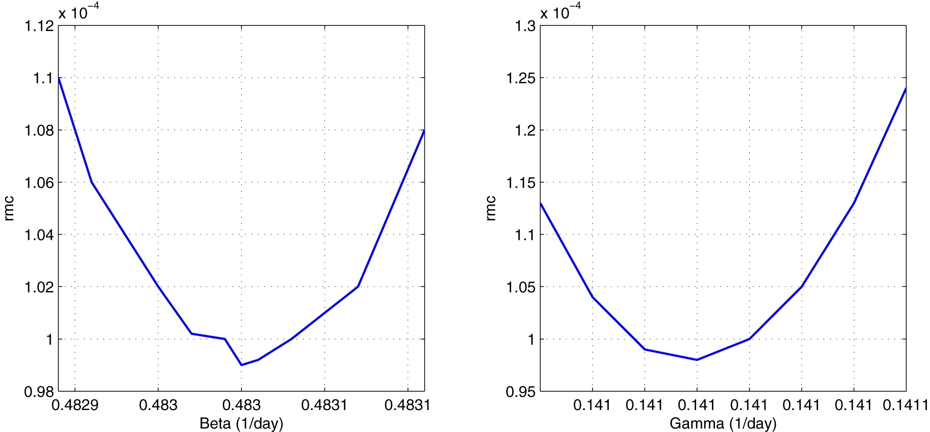
To the left: sensitivity test to calculate the value of β = 0.48305 day−1. To the right: sensitivity test to calculate the value of γ = 0.14102 day−1. The normalized variance is 9.8 × 10⁻⁵.
It is important to notice that we are using the number of reported deceased people rather than the number of reported infected subjects in the inversion process. Unfortunately, the number of reported infected people is always underestimated compared to the actual number of infected people. This happens because many subjects that do not show symptoms are not tested, therefore they escape the official report. Therefore, the inversion process is based uniquely on the deceased data.
The numerical model was run on an Intel Core i7 computer, using a Matlab-encoded program. The duration of the program execution took 3 s on average, for a time step Δt = 0.01 day, with a total of Nk = 60,000 iterations.
Results and discussion
The effect of social isolation, quarantined population and vaccination process was taken into account and the deceased population is included in the SAIRDQ numerical model. Figure 5 and Table 1 show the results of the SAIRDQ model for the evolution of the pandemic in Perú. Table 2 explains the occurrence of important dates.
Effect of social isolation and quarantine
We have simulated the scenario with the relaxation of social isolation and quarantine from the end of the first wave of the epidemic. The death toll would be around 1.5 million people. In this case, the second wave would be much larger than the first one.
Figure 7(a) shows the evolution of the pandemic taking into account the finish of the quarantine on 28 February 2021 and then the conditions are relaxed (η = 0, η 2 = 0). We noticed that the second wave would be a “tsunami”. The simulated death toll would be around 280 thousand.

To the left: the quarantine is finished on 28 Feb 2021 and then the conditions are relaxed. The second wave would be a true “tsunami”, with more than 280 thousand deaths in the next 12 months. To the right: no vaccination was applied, the death toll would be more than 400 thousand people. Day one corresponds to March 6, 2020.
On the other hand, in the ideal case of total social isolation and quarantine (at 100%), the peak of infections would be 8 and only 4 people would lose their lives, that is, those infected would be only in the family environment of the first infected.
Due to the end of the national quarantine on July 1, 2020, and the relaxation conditions of the population behaviour concerning quarantine since before the finish of it, the parameter β and η were considered variable by sections, according to Table 1. Therefore, the conditions of the SAIRDQ numerical model have changed. In Figure 5, the base of the infection curve (in blue) has widened, which means we have a second epidemic wave.
One effect of the quarantine and social isolation is the widening and flattening of the epidemic curves and the existence of successive waves of the epidemic. This is good for providing valuable resilience time to the overloaded healthcare system.
Effect of the vaccination process
We have simulated the effect of no vaccination and the same conditions of parameters in Table 1. The results show a death toll of more than 400 thousand people and the presence of at least two waves of the epidemic. In this scenario would be more than two waves and the death toll would increase with time.
In the real case, the vaccination began on 8 February 2021 (day 340) with the highest age group and so on descending. In the first weeks, the vaccination rate was very slow, ψ = 12,000 on average, due to global vaccine shortages. From the day = 416 (25 April 2021), the vaccination rate has increased to ψ = 90,000 on average. Now, the vaccination rate is: ψ = 100,000 on average.
To date (December 2021), more than 21.5 million people have been vaccinated with the two doses of the vaccine. This represents 66% of the total Peruvian population (https://data.larepublica.pe/avance-vacunacion-covid-19-peru). It is possible that by the end of the year 2021, the entire population over 12 years old in Peru will be vaccinated.
Vaccination is the most important way to defeat the coronavirus epidemic. As a recommendation, we must continue in social isolation and family quarantine until the arrival of vaccines and vaccination of all the family members.
Estimation of percentage of undiagnosed infective people
We have conducted the inversion process taking into account only the number of deceased people, because this parameter is more confident than the number of infected people, due to the number of undiagnosed infective people (asymptomatic).
The number of reported infected subjects is always underestimated compared to the actual number of infected subjects; therefore, the difference between the simulated infected people and the reported infected people would be the number of undiagnosed people (Figure 8B). This big hidden reservoir is also very important for the spread of the coronavirus. An estimation of the percentage of asymptomatic people is (Eq. (19)):
Where: I r is the number of reported infected people (2.2 million) and I s is the number of simulated infected people (3.99 million). Therefore, according to Eq. (19), the asymptomatic group represents the 45% approximately. This result agrees with that of Ma et al. (2021), with a global percentage of asymptomatics of 40.5%.

Comparison of epidemiological curves.
(A) Comparison of the reported and simulated deceased data which were tuned in order to minimize the normalized variance. (B) Comparison of reported and simulated infected people, the difference represents an estimation of the number of undiagnosed infective people.
The ratio of reported deceased people to reported infected subjects in Peru (around 10%) is much higher than in most other countries (typically 1–2%), which may be due, at least in part, to an underestimation of the actual number of infected people. Statistics miss the asymptomatic subjects.
About the new variants of the coronavirus
In the last months, new variants of the coronavirus have appeared. The emergence of new, more contagious variants, such as the Delta and Omicron variants, as well as the increasing evidence that immunity (either from vaccination or from illness) can fade over time, would probably make the model proposed in this research unsuitable to handle the next years of the pandemic. However, these new factors would not be important during the period considered in this research (2020–2021).
To take into account the new variants of coronavirus, the numerical model would change with the addition of a path from the R compartment back into the S compartment; however, this would be the subject of another research paper.
Conclusions
The dynamic evolution of an epidemic is not governed by numerical models, rather it depends on the behaviour of the population against the sanitary measures given by the central or regional government. However, numerical models are useful for simulating probable scenarios, allowing for more efficient decision making.
The official Peruvian data has been updated on June 2021. According to this data, the peak of the infected curve was on day 399 and the peak of the deceased curve was on day 413, with a difference of 14 days. This is an important number, it marks the gap between the two curves. The second wave of the epidemic began on January 05, and it was greater than the first one. Nowadays (September 2021), we are finishing the second wave.
The most challenging point of any epidemiological simulation research is the estimation of the epidemiological parameters of the numerical model (α, β, γ, η and μ). The available data (number of infected and deceased) from public institutions, allow the estimation of some of them. The basic reproduction number was estimated at R 0 = 2.30.
The effect of quarantine has been simulated by varying the parameter η and η 2 (isolation rates). The isolated population would not be contagious because there was no interaction with the infected population. In the case of the actual quarantines in Peru, the total number of deceased would be around 200 thousand. If the quarantine and social isolation were totally relaxed from the beginning, the total number of deceased would reach several million. For a total quarantine (100%), there would only be 4 deaths. Therefore, quarantine and social isolation are the most effective measures to counter the impact of the epidemic.
Due to the relaxation and end of the first quarantine on July 1, the parameters β and η have changed; therefore, the base of the infection curve has widened with the appearance of a second epidemic wave on January 2021, with a prolongation of the pandemic for several additional months, perhaps until December 2021. We must continue in social isolation unless we are vaccinated.
The undiagnosed infective people or asymptomatic group is a big hidden reservoir very important for the spread of the coronavirus. An estimation of the percentage of asymptomatic people for the Peruvian case is 45%.
Acknowledgments
We thank Dr. Roxana López (UNMSM) for her comments in the revision of the manuscript. We acknowledge the funding from Concytec, through the RENACYT Research bonus.
-
Research funding: No funding.
-
Author contribution: All authors have accepted responsibility for the entire content of this manuscript and approved its submission.
-
Competing interests: Authors state no conflict of interest.
-
Informed consent: Not applicable.
-
Ethical approval: Not applicable.
References
Accinelli, R., C. Zhang, J. Wang, J. Yachachin, J. Cáceres, K. Tafur, R. Flores, and A. Paiva. 2020. “Covid-19: La pandemia por el nuevo virus sars-cov-2.” Revista Peruana de Medicina Experimental y Salud Pública 37 (2): 302–11. https://doi.org/10.17843/rpmesp.2020.372.5411.Search in Google Scholar PubMed
Bacaer, N., J. Ripoll, R. Bravo, X. Bardina, and S. Cuadrado. 2021. Matemáticas y Epidemias, 1st ed. Paris: Editorial Cassini.Search in Google Scholar
Brauer, F., and C. Castillo-Chavez. 2012. Mathematical Models in Population Biology and Epidemiology, 2nd ed., vol. 40. New York: Springer.10.1007/978-1-4614-1686-9Search in Google Scholar
Carcione, J., J. Santos, C. Bagaini, and J. Ba. 2020. “A Simulation of a Covid-19 Epidemic Based on a Deterministic SEIR Model.” Frontiers in Public Health 8 (230): 1–13. https://doi.org/10.3389/fpubh.2020.00230.Search in Google Scholar PubMed PubMed Central
Cellier, F., and E. Kofman. 2006. Continuous System Simulation, 1st ed. New York: Editorial Springer.Search in Google Scholar
Giordano, G., F. Blanchini, R. Bruno, P. Colaneri, A. Di Filippo, A. Di Matteo, and M. Colaneri. 2020. “Modelling the Covid-19 Epidemic and Implementation of Population Wide Interventions in Italy.” Nature Medicine 26: 855–60. https://doi.org/10.1038/s41591-020-0883-7.Search in Google Scholar PubMed PubMed Central
Jiménez, C., C. Carbonel, and J. Villegas-Lanza. 2020. “Seismic Source of the Earthquake of Camana Peru 2001 (Mw 8.2) from Joint Inversion of Geodetic and Tsunami Data.” Pure and Applied Geophysics 178: 4763–75. https://doi.org/10.1007/s00024-020-02616-8.Search in Google Scholar
Jiménez, C., N. Moggiano, E. Mas, B. Adriano, Y. Fujii, and S. Koshimura. 2014. “Tsunami Waveform Inversion of the 2007 Peru (8.1 Mw) Earthquake.” Journal of Disaster Research 9 (6): 954–69. https://doi.org/10.20965/jdr.2014.p0954.Search in Google Scholar
Kermack, W., and A. McKendrick. 1927. “A Contribution to the Mathematical Theory of Epidemics.” Proceedings of the Royal Society of London 115: 700–21.10.1098/rspa.1927.0118Search in Google Scholar
Lopez, R., M. Vidal, and W. Valdez. 2015. Nociones básicas de modelamiento matemático aplicado a la epidemiología, 1st ed. Lima: Ministerio de Salud, Dirección General de Epidemiología.Search in Google Scholar
Ma, Q., J. Liu, Q. Liu, L. Kang, R. Liu, W. Jing, Y. Wu, and M. Liu. 2021. “Global Percentage of Asymptomatic SARS-CoV-2 Infections Among the Tested Population and Individuals with Confirmed COVID-19 Diagnosis.” Infectious Deseases 4 (12): e2137257. https://doi.org/10.1001/jamanetworkopen.2021.37257.Search in Google Scholar PubMed PubMed Central
Marinov, T., R. Marinova, J. Omojola, and M. Jackson. 2014. “Inverse Problem for Coefficient Identification in SIR Epidemic Models.” Computers and Mathematics with Applications 67: 2218–27. https://doi.org/10.1016/j.camwa.2014.02.002.Search in Google Scholar
Martcheva, M. 2015. An Introduction to Mathematical Epidemiology, 1st ed., vol. 61. New York: Springer.10.1007/978-1-4899-7612-3_1Search in Google Scholar
Munayco, C., A. Tariq, R. Rothenberg, G. Soto-Cabezas, M. Reyes, A. Valle, L. Rojas-Mezarina, C. Cabezas, M. Loayza, and G. Chowell. 2020. “Early Transmission Dynamics of Covid-19 in a Southern Hemisphere Setting: Lima-Peru.” Infectious Disease Modelling 5: 338–45. https://doi.org/10.1016/j.idm.2020.05.001.Search in Google Scholar PubMed PubMed Central
Nakamura, S. 2002. Numerical Analysis and Graphic Visualization with MATLAB, 2nd ed. New York: Prentice-Hall.Search in Google Scholar
Osemwinyen, A., and A. Diakhaby. 2015. “Mathematical Modelling of the Transmission Dynamics of Ebola Virus.” Applied and Computational Mathematics 4 (4): 313–20. https://doi.org/10.11648/j.acm.20150404.19.Search in Google Scholar
Pino, N., P. Soto-Becerra, and R. Quispe. 2020. “Un modelo matemático SIR-D segmentado para la dinámica de propagación del coronavirus (Covid-19) en el Perú.” Selecciones Matemáticas 7 (1): 162–71. https://doi.org/10.17268/sel.mat.2020.01.15.Search in Google Scholar
© 2022 Walter de Gruyter GmbH, Berlin/Boston
Articles in the same Issue
- Research Articles
- The impact of test positivity on surveillance with asymptomatic carriers
- COVID-19 vaccine hesitancy among undergraduate students in Thailand during the peak of the third wave of the coronavirus pandemic in 2021
- Accounting for the role of asymptomatic patients in understanding the dynamics of the COVID-19 pandemic: a case study from Singapore
- Incidence moments: a simple method to study the memory and short term forecast of the COVID-19 incidence time-series
- Numerical modelling of coronavirus pandemic in Peru